
The spread of the Corona Virus epidemic in the UK in March 2019, with the ensuing government enforced social distancing measures and restrictions on movement and association, resulted in the effective lockdown of many public places including educational establishments, council buildings and galleries. This led in turn to the cancellation of our planned end of year exhibition - which would have formed the basis of the submission for our Final Major Project module to complete the requirements of my BA Degree in Photography at Coleg Llandrillo in North Wales.I found it impossible to dispel my deep conviction that a physical print format would be the most appropriate way to present the particular body of work, a series of colour photograms made using the contents of my recycle bin. To resolve this dilemma I decided to build a personal gallery space as a 1 in 12 scale maquette in which to exhibit physical prints, as originally planned. The exhibition is called PLASTICITY and can be viewed on my portfolio website at http://www.derekcrawfordphotography.net or using the direct link to a You Tube Video at youtube.com/watch?v=g-rnFbcAeXg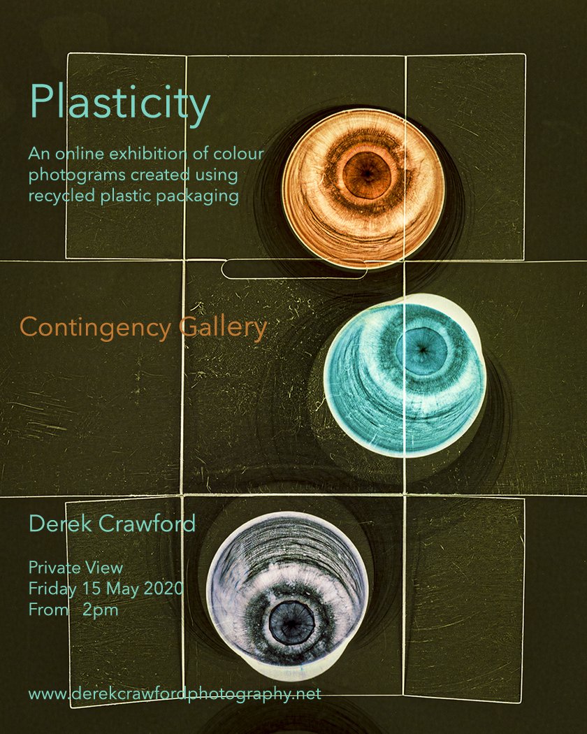

Garry Fabian Miller: SSHoP Annual Lecture
The presenter of the Annual Lecture of the Scottish Society for the History of Photography (SSHoP) at the National Gallery of Scotland in Edinburgh on 15th November 2019, was the contemporary fine art photographer Garry Fabian Miller. His presentation lasted just over one hour in which he described his career to date in detail including his family background, influences, a brief description of his early social documentary and landscape work, the thinking behind his switch in 1984 to camera-less photography, his current working practice and his collaborations with other artists, writers, poets and musicians.Born in 1957 to parents who ran (and lived in) a long established family studio photography business in Bristol, he was immersed in the atmosphere of the darkroom from early childhood. As a teenager his ambition was to become a 'serious' photographer, at a time when this effectively equated with social documentary photography. His first significant project as a teenager, influenced by the work of Paul Strand in the Outer Hebrides, involved at the age of sixteen, spending the summer of 1973 in the Shetland Islands, living with and documenting the lives of crofters and their families. Several of these images featured in the lecture and this experience of the cycles of rural life in remote wild places, has been a major influence on his life and work since then.A singular feature of his practice has been his use of Cibachrome paper and the dedicated chemistry required to process it, to produce all of his images since 1976. This dye destruction paper, designed as a reversal process for producing direct positive prints from colour transparencies, was known for its distinctively vivid but true to life colour palette, strikingly high gloss almost metallic surface finish and exceptional archival stability. Fabian Miller found that with long enough exposures, he was able to use this paper instead of film in a 10x8 inch large format camera, to photograph seascapes of the Severn Estuary from an attic window in his home. This resulted in 'Sections of England: The Sea Horizon' his first major work, which was first shown in 1977 in the Serpentine Gallery in London and formed the basis of his first solo exhibition in the Arnolfini Gallery in Bristol in 1979.He moved to live in a farm in Lincolnshire in 1980 and having developed an interest in Land Art, he transformed a barn into a small gallery, where he met and showed the work of among others Hamish Fulton, Andy Goldsworthy, David Nash, Marie Yates and Roger Ackling. In 1984 he started experimenting with the use of semi-translucent natural materials, grasses, leaves, seed heads and flower petals, placed in the negative carrier of his enlarger and exposed onto Cibachrome paper to make photographs direct from life. By the following year he had decided at the age of 25, that he no longer needed a camera. He made several seasonally based series of images, documenting the sequential changes in the colour of leaves as the chlorophyl levels changed over a period of weeks and several of these are now in the permanent collection of the Victoria and Albert Museum in London.In 1989 he moved with his family to Dartmoor, designed and built a studio with his darkroom at the bottom of their large garden, where he estimates he has spent at least fifty per cent of his waking hours ever since. In around 1992 he virtually stopped using plant materials having developed a technique for projecting beams of light, filtered through glass vessels containing coloured oils and liquids, directly onto photosensitive paper, with only small pieces of card placed in the light path to produce the geometric shapes in his photographs. His work has become progressively more abstract and since 2017, he has experimented with using additional small light sources, for example burning matches, to produce localised bright highlights mimicking the appearance of flames. His daily routine also involves walking , either in the early morning or the evening, taking inspiration in the special auras of light in the skies and the colours this produces in the blossoms of the vegetation, along with the atmosphere of the ancient archeological sites and burial cairns on the surrounding moorland, which he tries to represent in his work. Although most of his work has been made in his own darkroom, he has made some images on visits to the islands of Tiree, off the West coast of Scotland, Skellig Michael and Inis Meain (one of the Aran Islands), both off the West coast of Ireland. He described Inis Meain as one of the last bastions of purity in Ireland, a view shared by the artist Sean Scully, who made one of his few books of photographs on the island. While Fabian Miller always works alone in his darkroom, when it comes to distributing his work he has collaborated extensively with other artists including writers, poets, musicians, potters, weavers and curators. One of his most important collaborations over the years has been with Martin Barnes, the curator of Photography at the V&A Museum, who has aquired his work for their collection, wrote an introduction to one of his books, curated his 2005 exhibition at the V&A and included his work in the major retrospective exhibition of camera-less photography, 'Shadow Catchers' also at the V&A in 2011. Several other authors have also contributed to sections in his books, including Marina Warner, Nigel Warburton and Adam Nicolson (The Colour of Time, 2010) and the author and ceramicist Edmund de Waal with the poet Alice Oswald (Blaze, 2019). Alice Oswald has also collaborated in live performances of his work along with her poetry as has the cellist and composer Oliver Coates.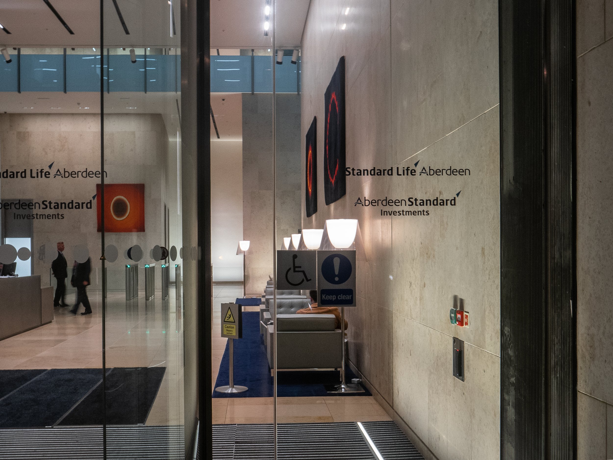 Since 2013, Fabian Miller has also worked with the weavers in the Dovecot Studio in Edinburgh, making gun tufted rugs (some of which have been acquired by the Standard Life Aberdeen Investment Bank for the foyer of their Edinburgh Head Office - see photograph above) and in 2017 a tapestry, based on the colours and shapes in his photographs. Probably his most important collaboration over the last ten years has been with John Bodkin a master of digital printing who has helped in the challenging process of colour correcting high resolution scans of Fabian Miller's Cibachrome prints, while trying to maintain as closely as possible the subtleties of their original appearance and surface. This allows them to be re-printed to archival standards as 'C'prints using the Lambda Lightjet printing system, for exhibition at a much larger scale. Some of these prints were recently exhibited at the Ingleby Gallery in Edinburgh who have also worked closely with Fabian Miller for many years (see previous post from 16 Dec 2019).Moving into the third decade of the 21st century, it is relatively unusual to find an internationally acclaimed photographer whose primary method of creating images is so completely dependent on a traditional wet darkroom process. This is all the more surprising on discovering that no Cibachrome papers have been manufactured since 2012. Cibachrome papers are relatively stable if correctly stored (in a freezer) and Fabian Miller had the foresight to stock up when the last batch was produced. This supply is running out and he is down to his last one hundred sheets. There may be a few individuals around the world who still have small stocks in storage but they are unlikely to become available and their archival status will be unpredictable. The Cibachrome process chemistry is if anything more difficult to store and although there are possible work arounds using monochrome developers and RA4 process bleach/fix, he has decided that when he completes his current project using his remaining stock, he will close his darkroom forever. A very well written account of the saga of the demise of Cibachrome/Ilfochrome is available online (Vincent 2018).Under the circumstances, Fabian Miller seems remarkably optimistic about the future. He has a large library of work already made and now has access to the skills required to work with this digitally. He stopped selling his Cibachrome originals some time ago to retain them for future projects and now only sells his work as Lambda Lightjet 'C'prints. Although his work has can appear very precise and controlled, his almost poetic relationship with the elemental forces which shape his connection to the land are still very apparent. He discovered very recently that the building in Bristol in which he had been brought up, was at one time owned by the publisher Joseph Cottle. In one of their well documented walking tours in the 1790's, William Wordsworth and his sister Dorothy along with Samuel Taylor Coleridge, stayed for several days with Cottle in Bristol, before crossing the Severn by ferry to travel up the Wye Valley to Tintern. It transpires that Dorothy Wordsworth slept in the bedroom, which in later years became the darkrooom in which he still remembers playing as a child, while his parents were printing their work. He is currently trying to work out if there is a way of using this in the generation of his next project.The importance of the darkroom and its role in the history of the photography which so dramatically transformed our interactions with the rest of the world, can perhaps only be fully appreciated by those who have experienced working in one. In an attempt to address this, Historic England spent several days with Fabian Miller in 2016, documenting his working process. He has also made arrangements with the V&A Museum that when he does close his darkroom, it will be dismantled and installed in their Photography section as a new exhibit for visitors to experience. His archive of darkroom notebooks will also be acquired by the museum to be made available to future researchers.In discussion following the lecture, he was asked if his experience of the demise of Cibachrome felt like coming to the end of a prolonged terminal illness. While agreeing that the end of Cibachrome was sad, he feels that the potential of digital photography is exciting and that it is probably still in its infancy, with much still to be explored. He feels that it is important that people understand that the invention of chemical photography was a seminal moment in world history and is encouraged by the fact that there are still people who are trying to keep it alive. He has been thinking for some time about the early experiments of Fox Talbot and his correspondence with John Herschel, wondering if there is any scope for further research into this source material for clues as to developing other new processes. Examples of Fabian Miller's work and links to interviews with him are available at the websites of the V&A Museum, the Ingleby Gallery and on his own site, at www.garryfabianmiller.com. Barnes M. and Fabian Miller G. (2005) 'Illumine'. Merell Publishing London.Barnes M. (2012) 'Shadow Catchers: Camera-less Photography'. Merell Publishing London.Fabian Miller G. (2010) 'The Colour of Time'. Black Dog Publishing, London.Fabian Miller G. (2019) 'Blaze" Ingleby, Edinburgh.Scully S (2007) 'The Walls of Aran' Thames and Hudson, London.https://www.inglebygallery.com/artists/51-garry-fabian-miller/overview/https://www.vam.ac.uk/collections/garry-fabian-miller
Vincent D (2018) A Brief History of Cibachrome Online at: https://douglasvincent.com/ilfochrome/history.html Accessed 11 February 2020

Garry Fabian Miller - Ingleby Gallery
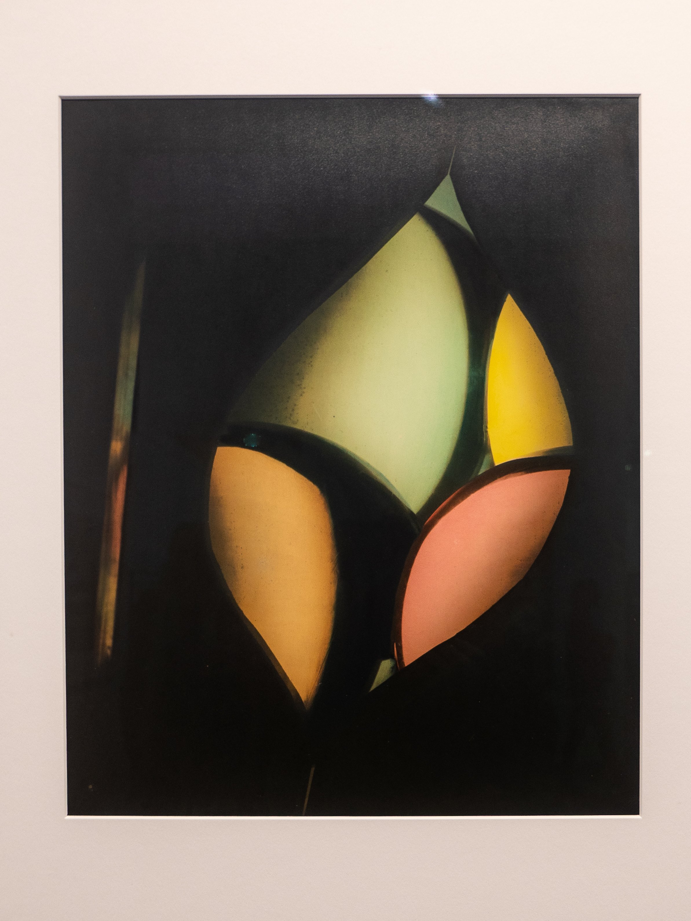
The Ingleby Gallery is a small privately run gallery located since May 2018 in an A-listed former Glasite* Meeting House in the historic New Town in Edinburgh. The gallery has held and regularly shown work by the Dartmoor based photographer, Garry Fabian Miller since 2000 and their current ongoing exhibition - 'Midwinter Blaze' - is a small selection of his large scale abstract prints. Fabian Miller is a relatively unusual photographer, inasmuch that for the last 30 years he has worked without a camera, creating his images in the darkroom using only light, projected directly onto Cibachrome papers, which use a (now discontinued) direct positive dye-destruction chemical process, renowned for producing a very characteristic vivid colour pallette. The colours in his prints are created by passing the light through coloured liquids or oils in glass containers of various shapes and sizes. He stopped selling his Cibachrome original prints in 2009, retaining these now for use as his working archive (and ultimately destined for the Victoria and Albert museum collection in London). He now produces his gallery scale images in collaboration with the printer John Bodkin, using a hybrid process in which the scanned originals are processed and printed from a digital enlarger onto photosensitive colour paper, then developed and fixed chemically (Lamda 'C' prints).
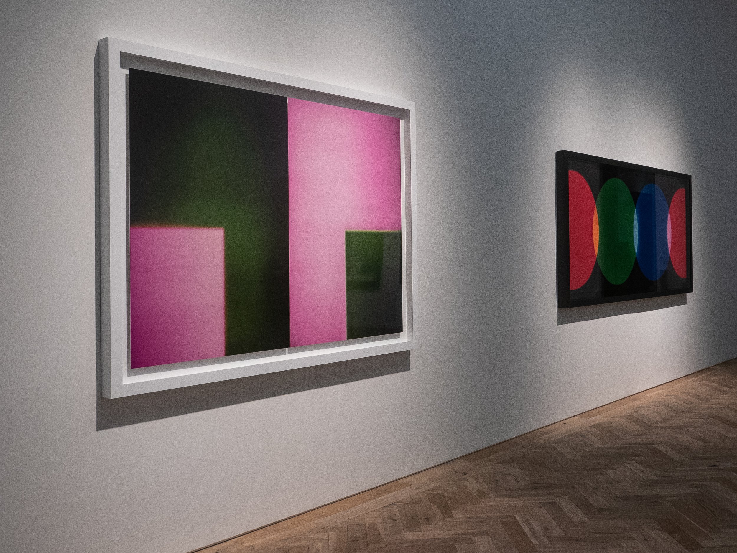 The main gallery in the Ingleby is a large single square room with a decorative but beautifully simple octagonal stained glass skylight at the centre of the ceiling.
 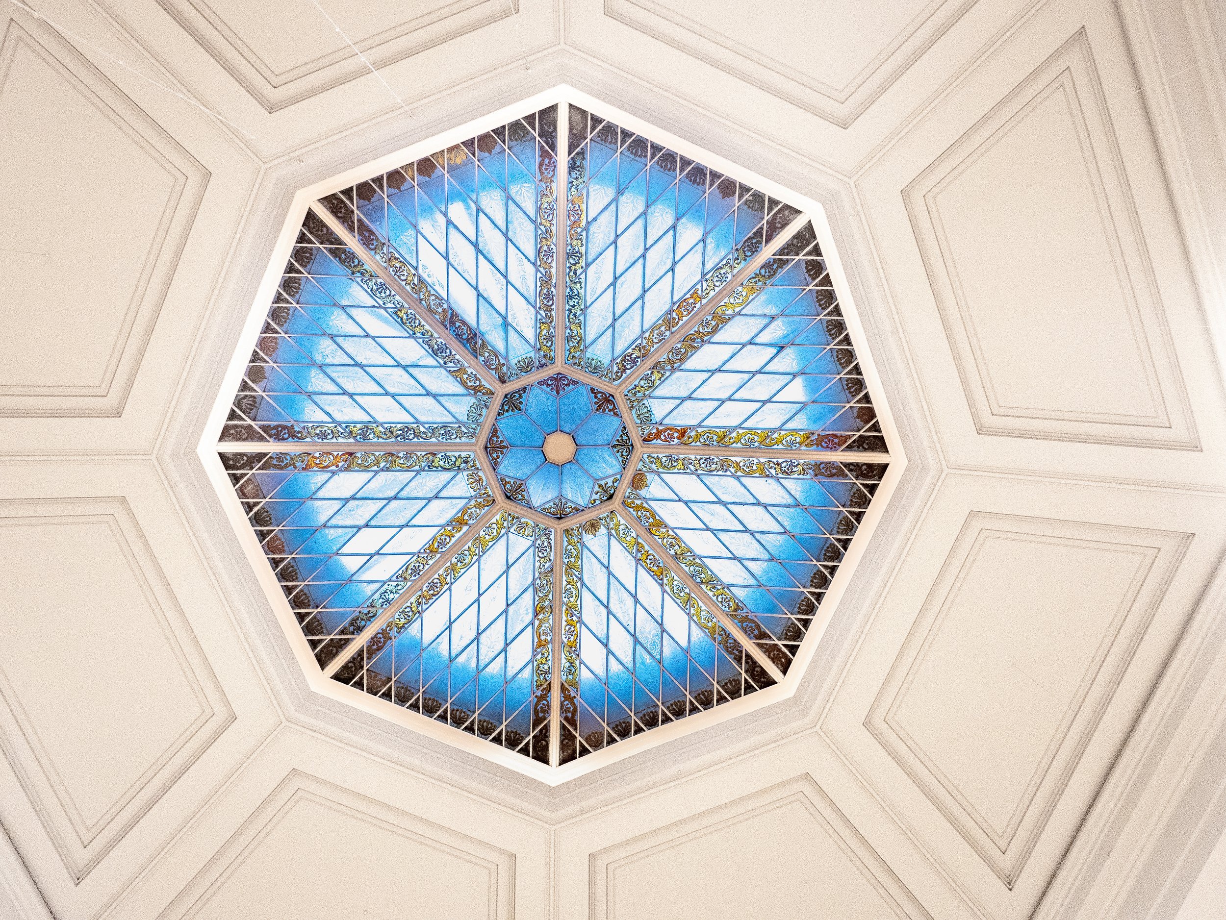 The corridor and stairs lead past the gallery offices and upstairs to a smaller more intimate second gallery, laid out like a large domestic drawing room with a period fireplace, deep comfortable couches and a large viewing table. The framed prints on the walls in this gallery are representative samples of the other artists affiliated to the Ingleby, shown as they could appear in a potential buyers home.
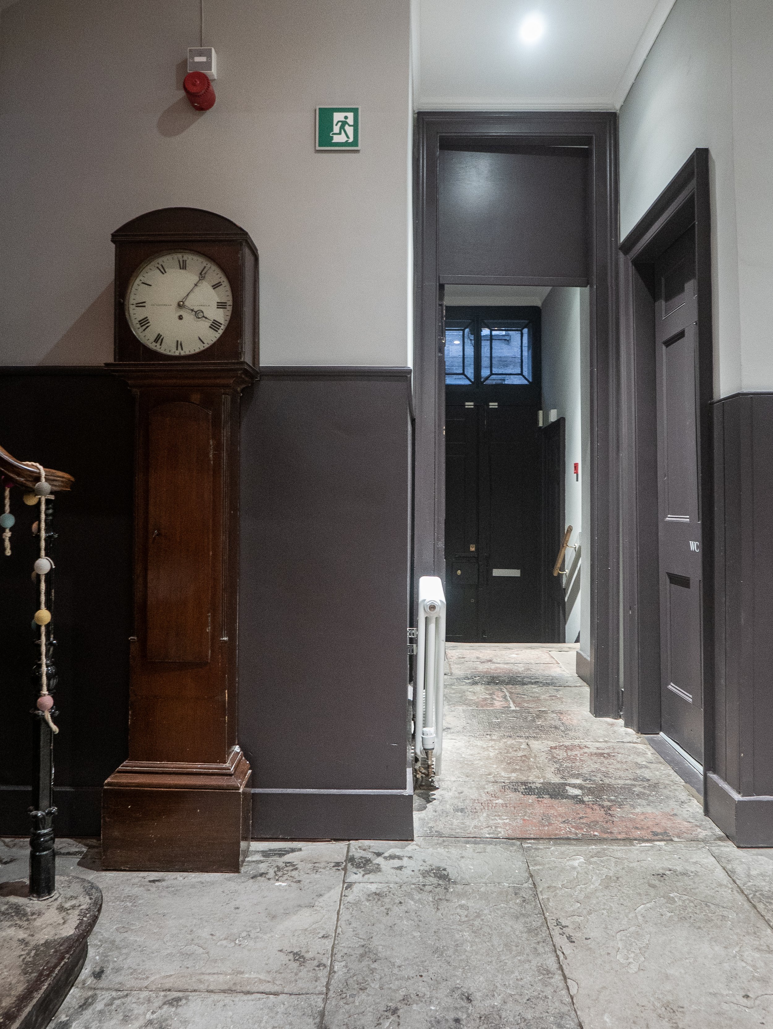 The gallery was visited late on a dark winter afternoon with the gallery lighting creating reflections on the glass frames so these photographs are presented simply to give an idea of the space and the scale of the work shown. They come nowhere near to reproducing the subtle detail or the true colours of the actual prints - the gallery website makes a much better job of this. Apart from their size and the vibrant colours, the striking feature of Fabian Miller's images is the luminescent high gloss finish, re-creating the unique almost metallic looking surface finish of Cibachrome, such that on first sight, it is difficult to be certain that they are prints and not in fact light boxes.
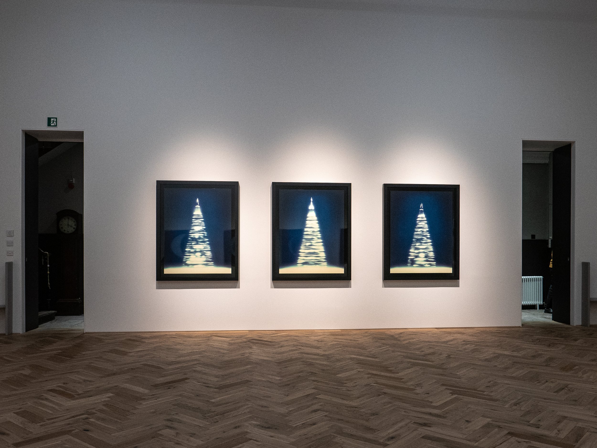 This exhibition finishes on 20th December 2019.www.inglebygallery.comwww.garryfabianmiller.com* According to the Ingleby Gallery website, the Glasites are a strict religious group of Scottish Protestants, who following the teachings of the Reverend John Glas, broke away from the Church of Scotland in 1732. The building was designed by Alexander Black and built in the 1830's. It was last used as a place of worship in 1989 and was in the care of the Scottish Historic Buildings Trust prior to the Ingleby Gallery moving in.

Royal Scottish Academy Annual Exhibition
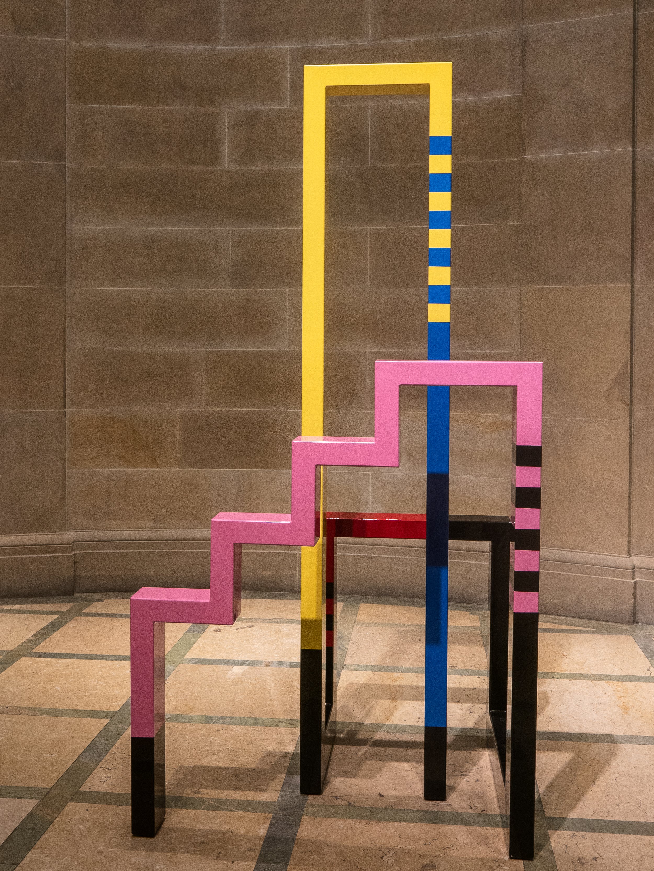
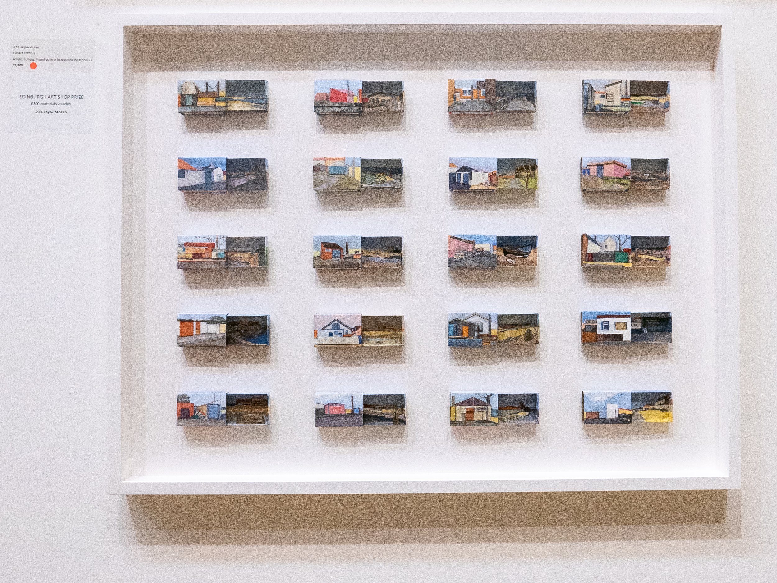
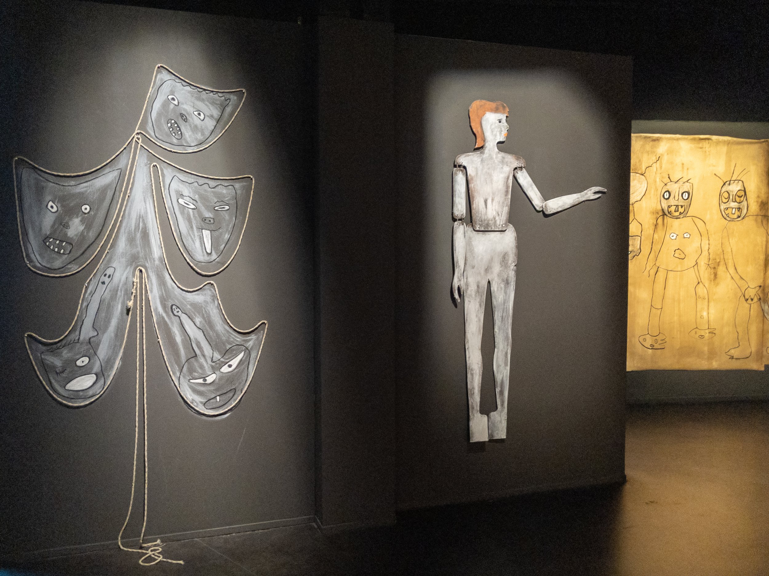
The 193rd Annual Exhibition of the Royal Scottish Academy of Art and Architecture, is showing currently in the National Gallery of Scotland on Princess Street, Edinburgh until 11th December, 2019. Entry is free and a generous selection of the work on show can be found on their very useful website. Most of the exhibits are paintings but there were also a reasonable number of sculptures, some installations and video art. The two rooms devoted to the architectural entries were particularly interesting.My own photographs below show some examples of just a few of the exhibits which particularly caught my eye.


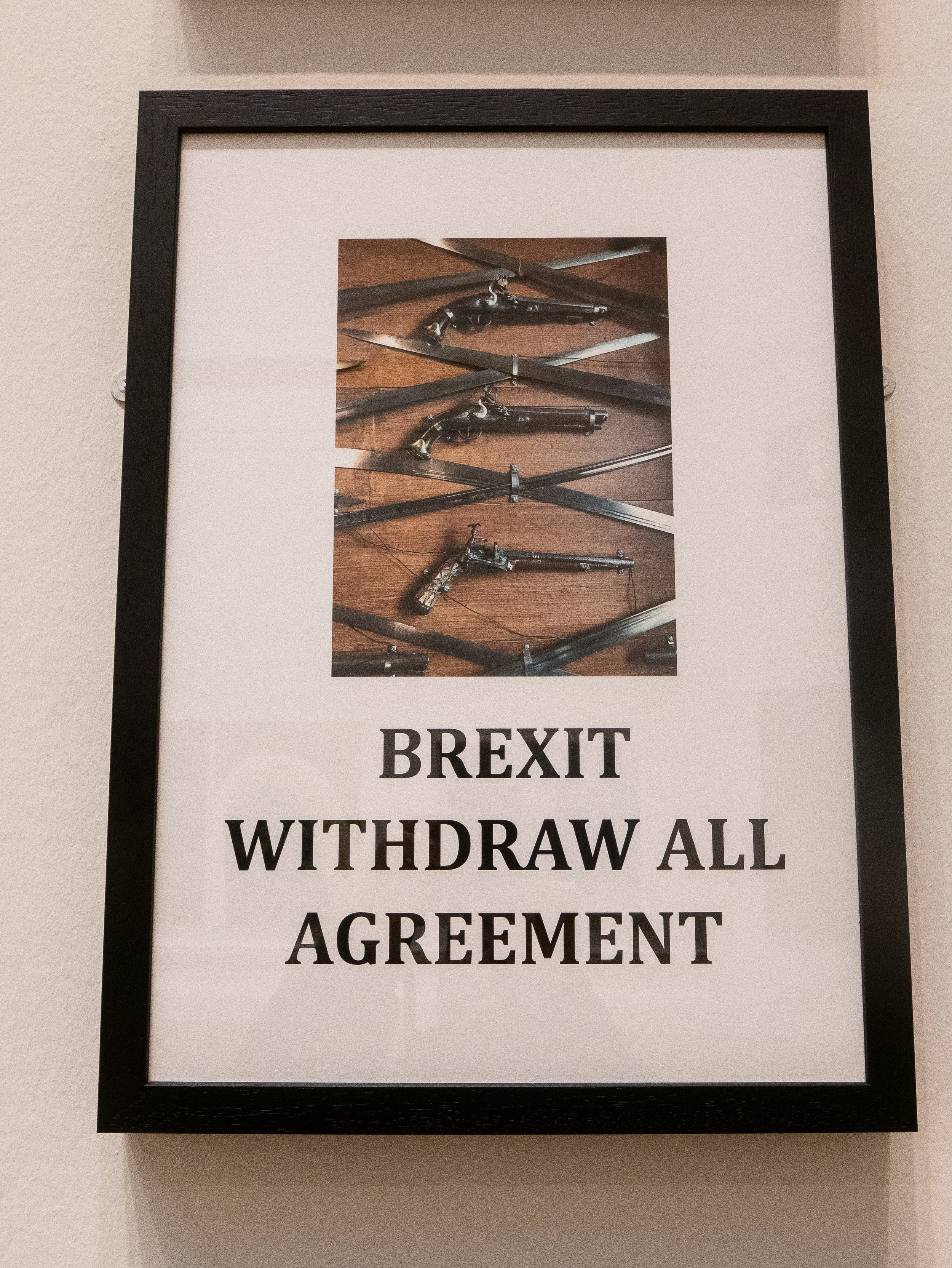
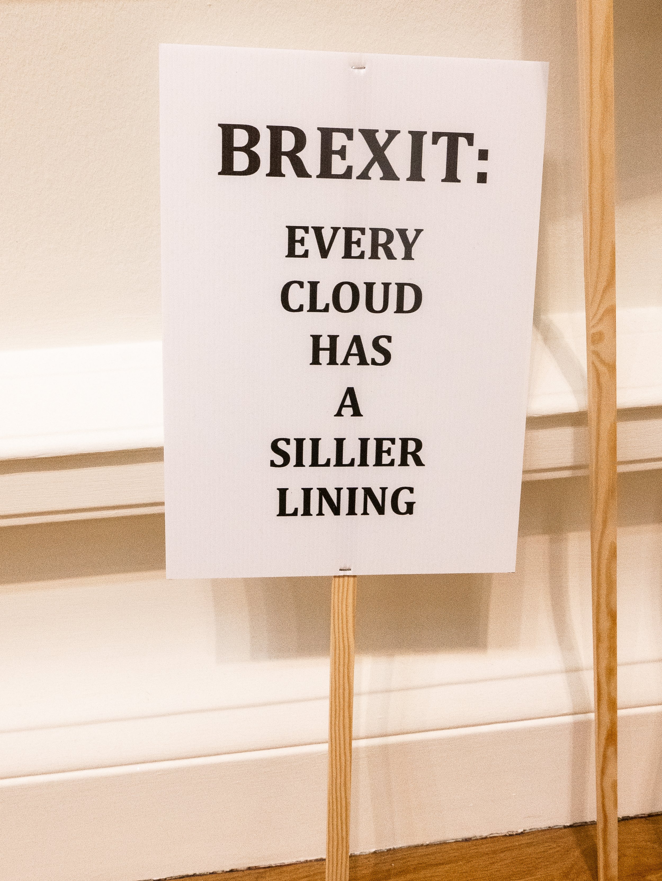 As a comment on the current state of play in UK politics, it seemed appropriate to show a closer look at the detail in this installation piece. The protester below who was photographed outside the gallery on the following morning appears to agree.
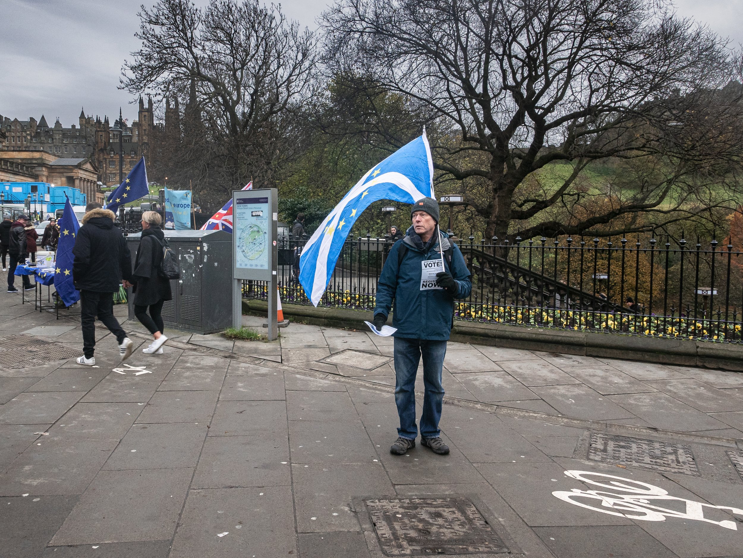 https://www.royalscottishacademy.org/exhibitions/rsa-annual-exhibition-2019/

Hassan Hajjaj - Maison Européenne de la Photographie
The Maison Européenne de la Photographie is a permanent gallery in the Hotel Henault de Cantobre (built in 1706) in the Rue de Fourcy in central Paris. Owned by the city of Paris, it opened as a gallery devoted solely to photography in 1985 and the current director Simon Baker was appointed in 2018, having previously worked as Senior Curator (International Art - Photography) at Tate Modern in London. He has now initiated a programme aiming to cover a diverse range of contemporary photography. The main feature exhibition when I visited in November, was the work of London based photographer Hassan Hajjaj, who had emigrated there with his parents from Larache in Morocco, when he was aged thirteen.This was an extensive exhibition featuring some of his earlier black and white and hand coloured monochrome prints but much of the space was devoted to his large scale almost life size vividly colourful portraits of his friends and colleagues from a wide variety of artistic backgrounds. The other really striking feature drawing from his background was his imaginative use of highly stylised frames featuring tins of food, canned drinks, sauce bottles or bobbins of thread.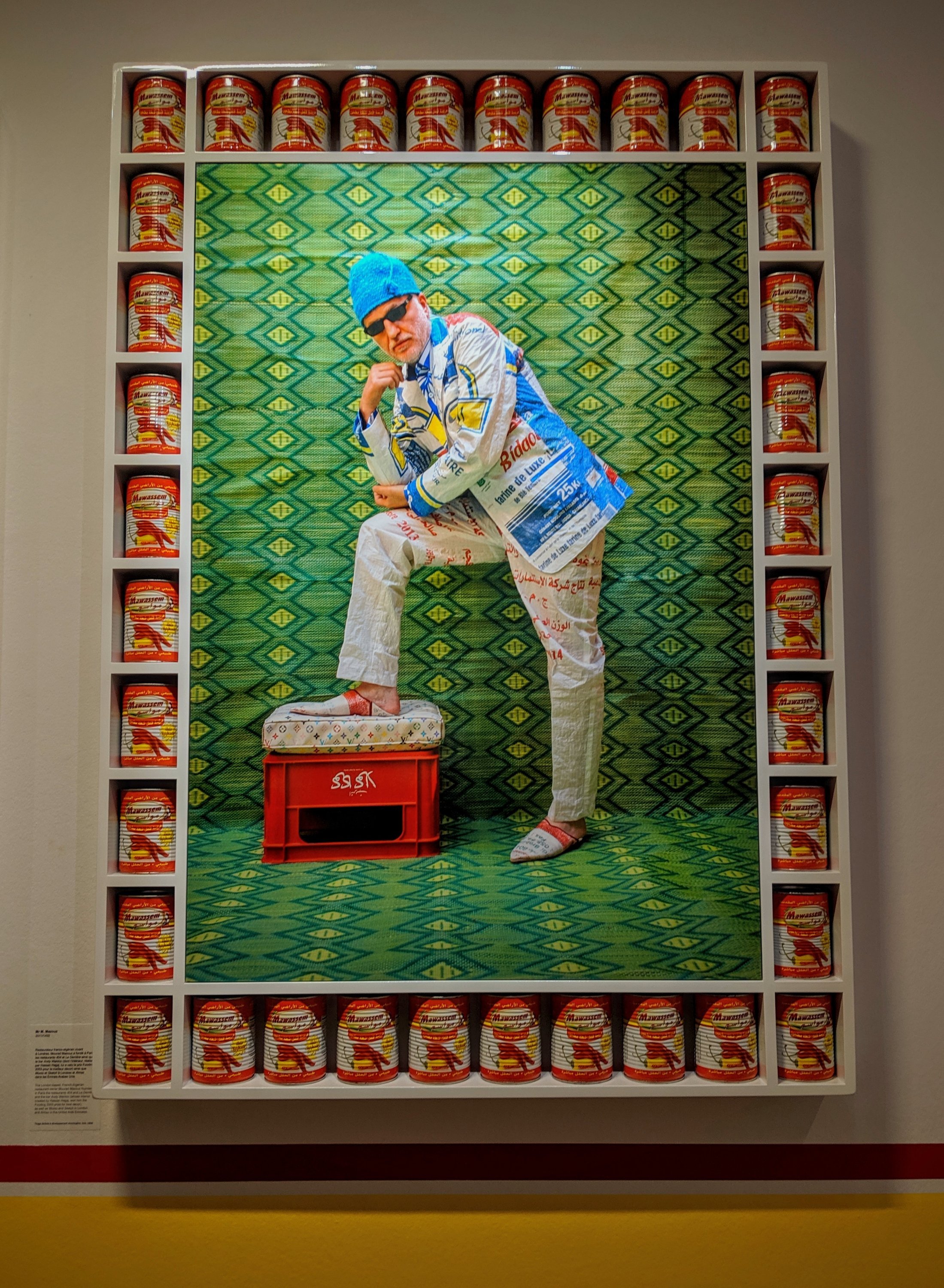
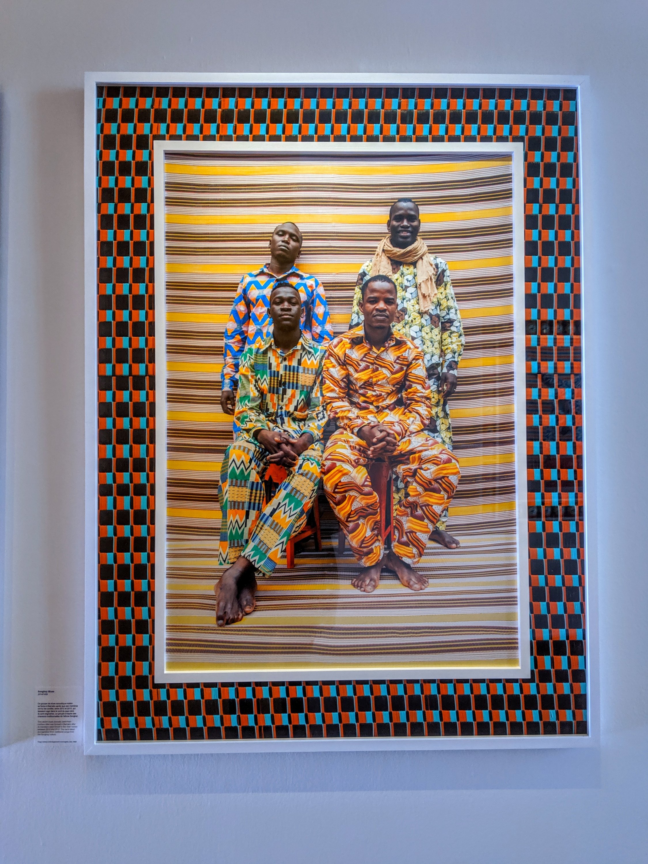 There is a strong thread of ironic humour running through his work but also a real sense of his pride in the communities he works in and his desire to see them represented fairly, in the positive light they deserve. There was a lot of excellent photography to see as running concurrently, the gallery was also showing some work by the female Moroccan photographers Zahrin Kahlo and Lamia Naji, with as a bonus a small selection of monochrome prints in a basement gallery by Malick Sidibé and Seydou Keita (both from Mali).www.mep-fr.orgwww.bjp-online.com/2019/10/hassan-hajjaj/

The World of Roger Ballen
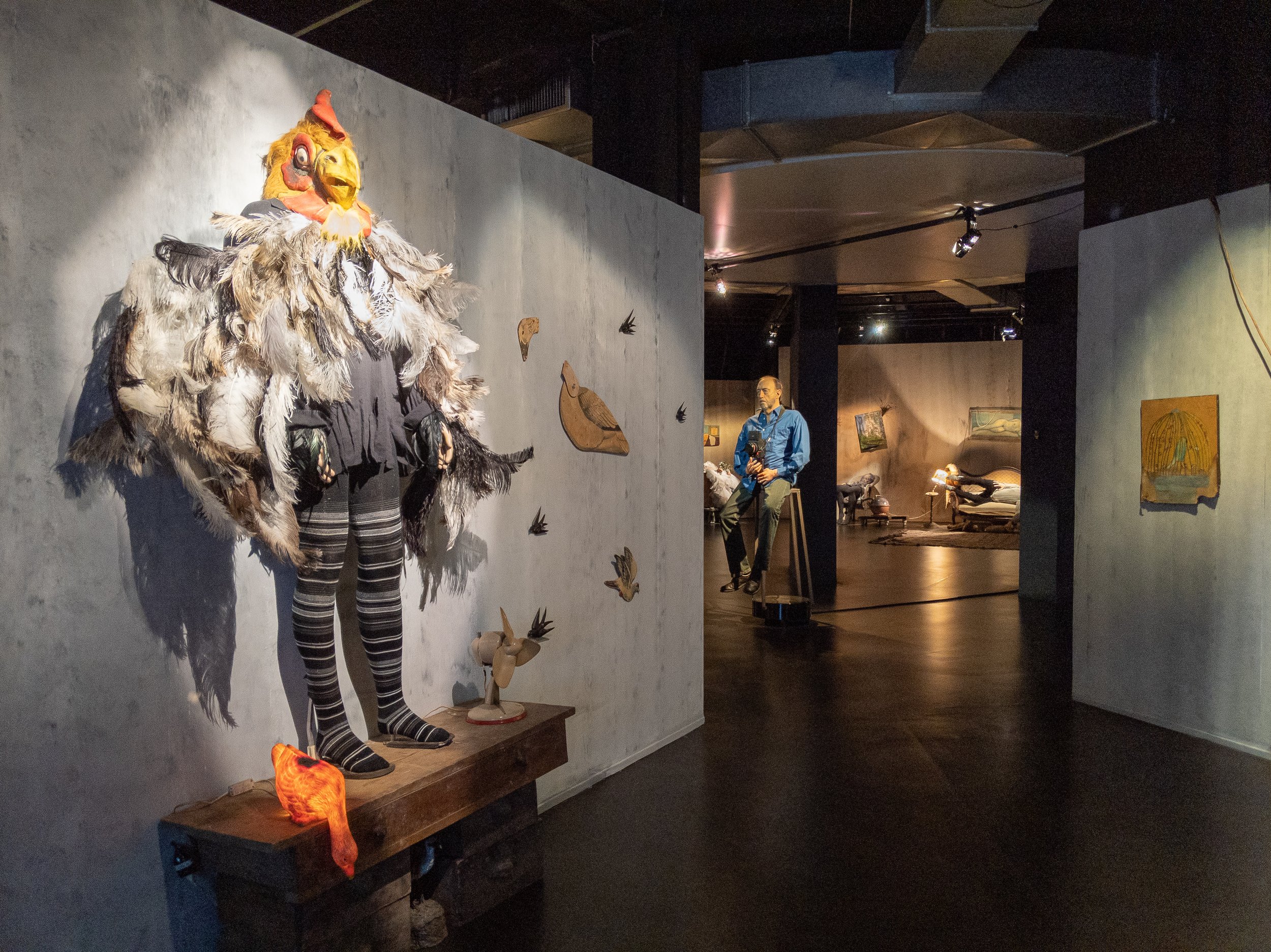
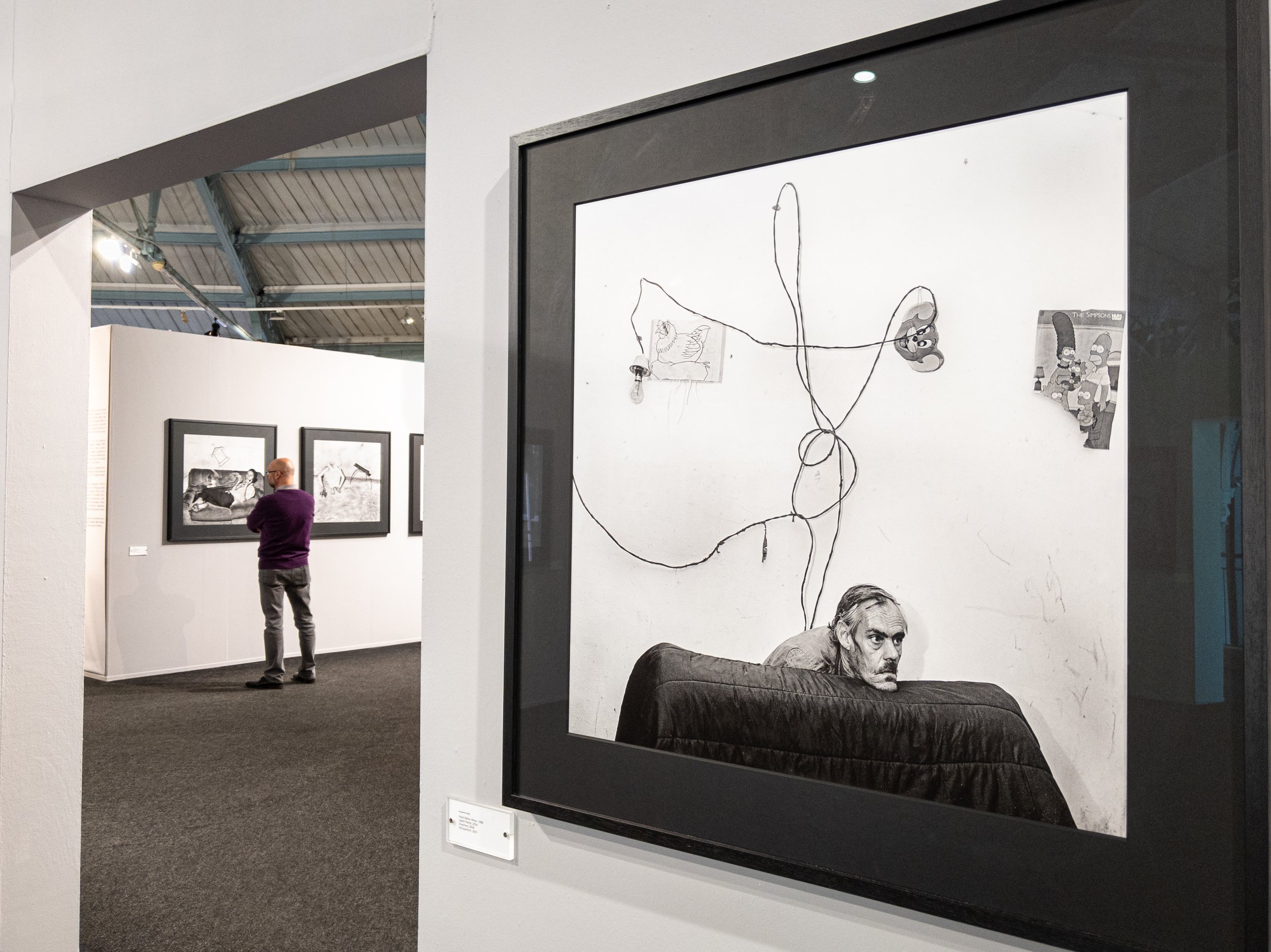
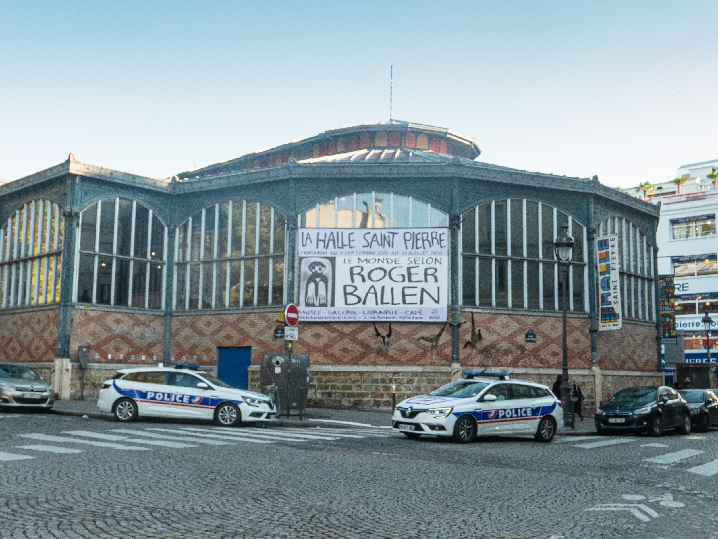
 "The World of Roger Ballen" is an exhibition of the work of one of the most innovative contemporary photographers, showing currently and until July 2020 at the Halle St Pierre in Montmartre, Paris. The gallery itself is a light airy space on two levels, the upper galleries being accessed from a balcony overlooking the ground floor cafe and bookshop. It specialises in showing 'Art Brut' or outsider art, makes it particularly appropriate for this work. The current exhibition uses the upper floor for a fairly standard formal presentation of a generous selection Ballen's photographs as large framed prints, with some of his drawings directly on the walls and some of the props used in his work. Downstairs, the gallery contains recreations of several of the spaces he has photographed in the form of a series of vignettes, again using the photographer's own props, models, artworks and even a life sized model of himself with his Rolleiflex on a rotating pedestal. There was also a separate projection room showing a sequence of short films of the places and people he has worked with.
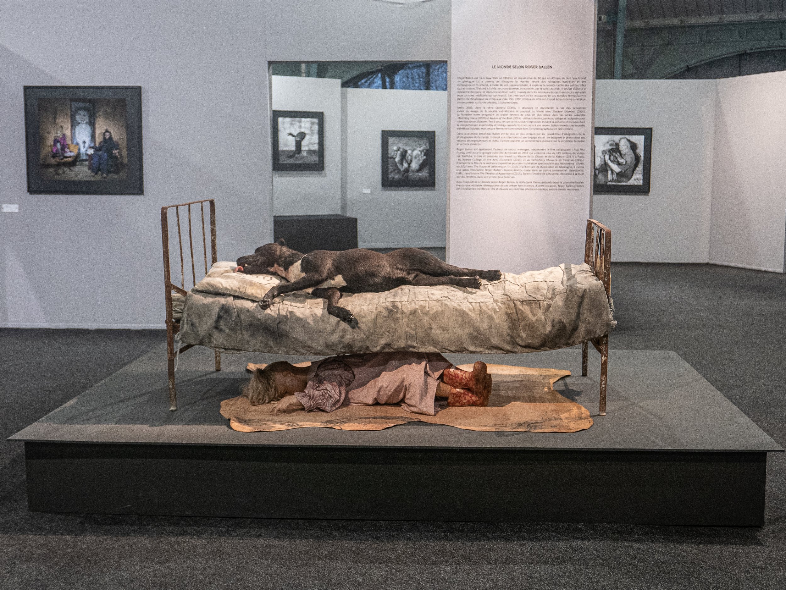
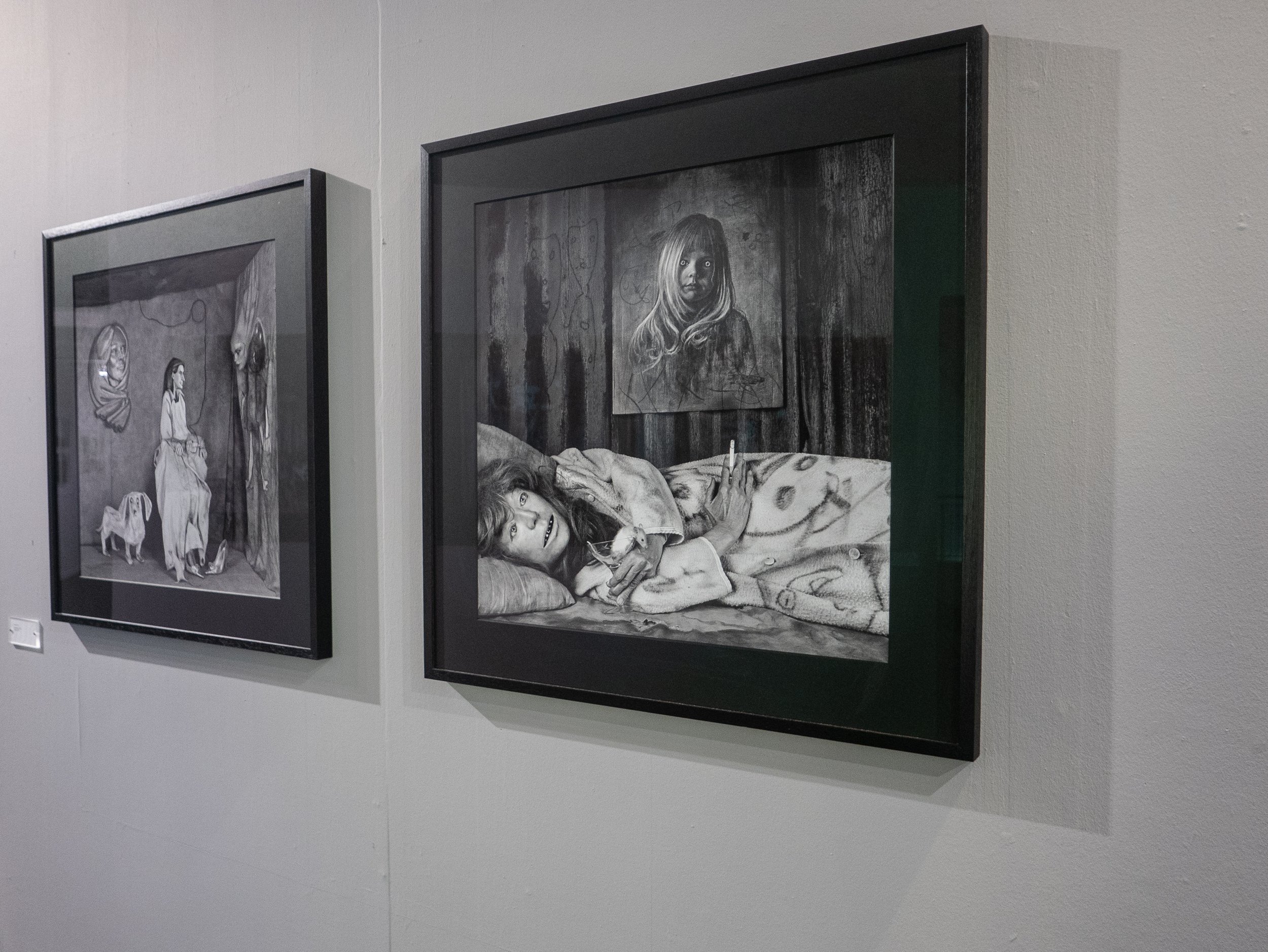
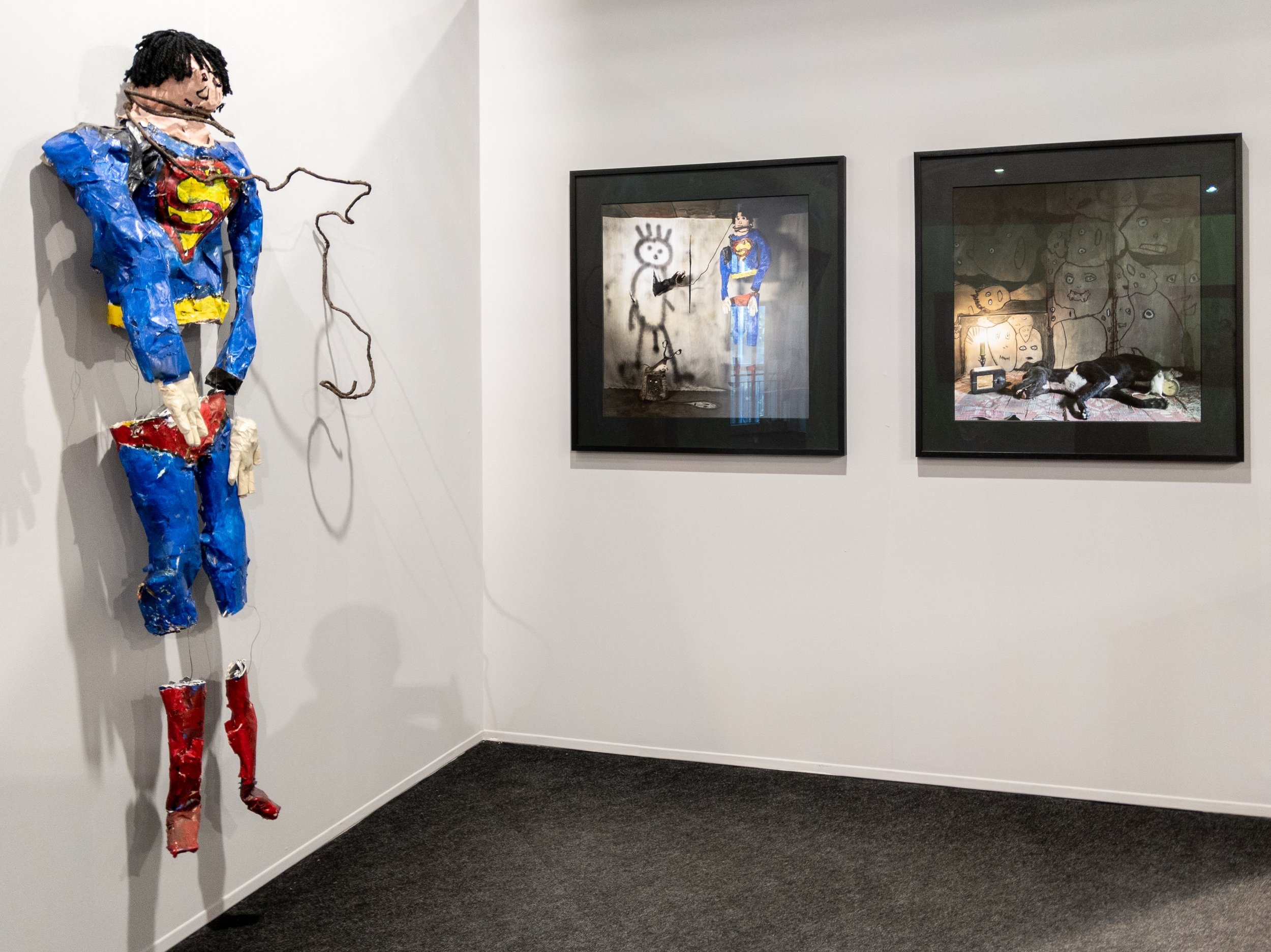
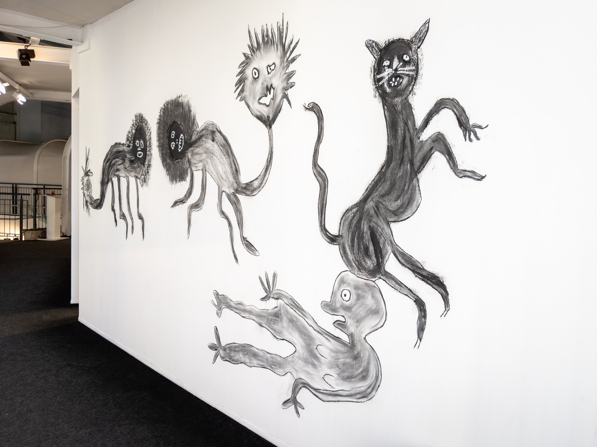


 As can be seen above, the places and people he has photographed would perhaps best be described as being on the very fringes of society and the images are imaginative, darkly humorous, intriguing and sometimes challenging. The films shown at the gallery are also available on his website and perhaps give a better feel for the atmosphere in which his work is created. Ballen has recently been interviewed for the October edition of the British Journal of Photography by Michael Grieve and an interview with him at Paris Photo is also available on their websitewww.rogerballen.comhttps://www.hallesaintpierre.org/wp-content/uploads/2012/01/DP-HSP_Roger-Ballen.pdfGrieve M. 'The World according to Roger Ballen', British Journal of Photography, Issue No.7888, pp 38-49, October 2019.

Butte de Montmartre, Paris.
The 'Basilique du Sacre Coeur de Montmartre' which dominates the skyline in the north of Paris is one of the most popular tourist attractions in the city and is undeniably impressive, especially when floodlit at night. While the Romano-Byzantine architectural features used in Paul Abadie's design suggest it could be much older, building started in 1875 and it was not completed until 1914 (though following the outbreak of the First World War, was not consecrated until 1919). The 'hill of the martyrs' was used as a site of worship by the Druids of ancient Gaul as well as the Romans and was documented as the site of the marytrdom of Saint Denis the first bishop of Paris in a history of the life of Saint Genevieve in 475AD. The last of several earlier churches had been destroyed a hundred years earlier following the French Revolution and the new basilica was commissioned following a 'vow of reparation' instigated by the Society of Saint Vincent de Paul, following the defeat of France in the Franco-Prussian war of 1870 with subsequent occupation by the German Army.For my trip to Paris Photo, the 'most affordable' hotel I could find within walking distance of the Gare du Nord, happened to be around the corner from where I made the photograph of Sacre Coeur above, in the Butte de Montmartre (the area around the bottom of the steps leading up to the Basilica). My first impression, that this was not one of the more well maintained parts of the city, was confirmed the following morning, when I opened the curtains of my room in the ironically named Hotel Bellevue. Unfortunately I did not have time to explore the more gentrified areas of Montmartre and did not get to the famous cemetery where several of the artists and poets who lived here are buried. There was however plenty to photograph in the narrow streets around the hotel, mainly cafes, restaurants, shops selling tatty tourist souvenirs and for some reason, all sorts of fabrics, most of which appeared to have been sourced from the middle east.
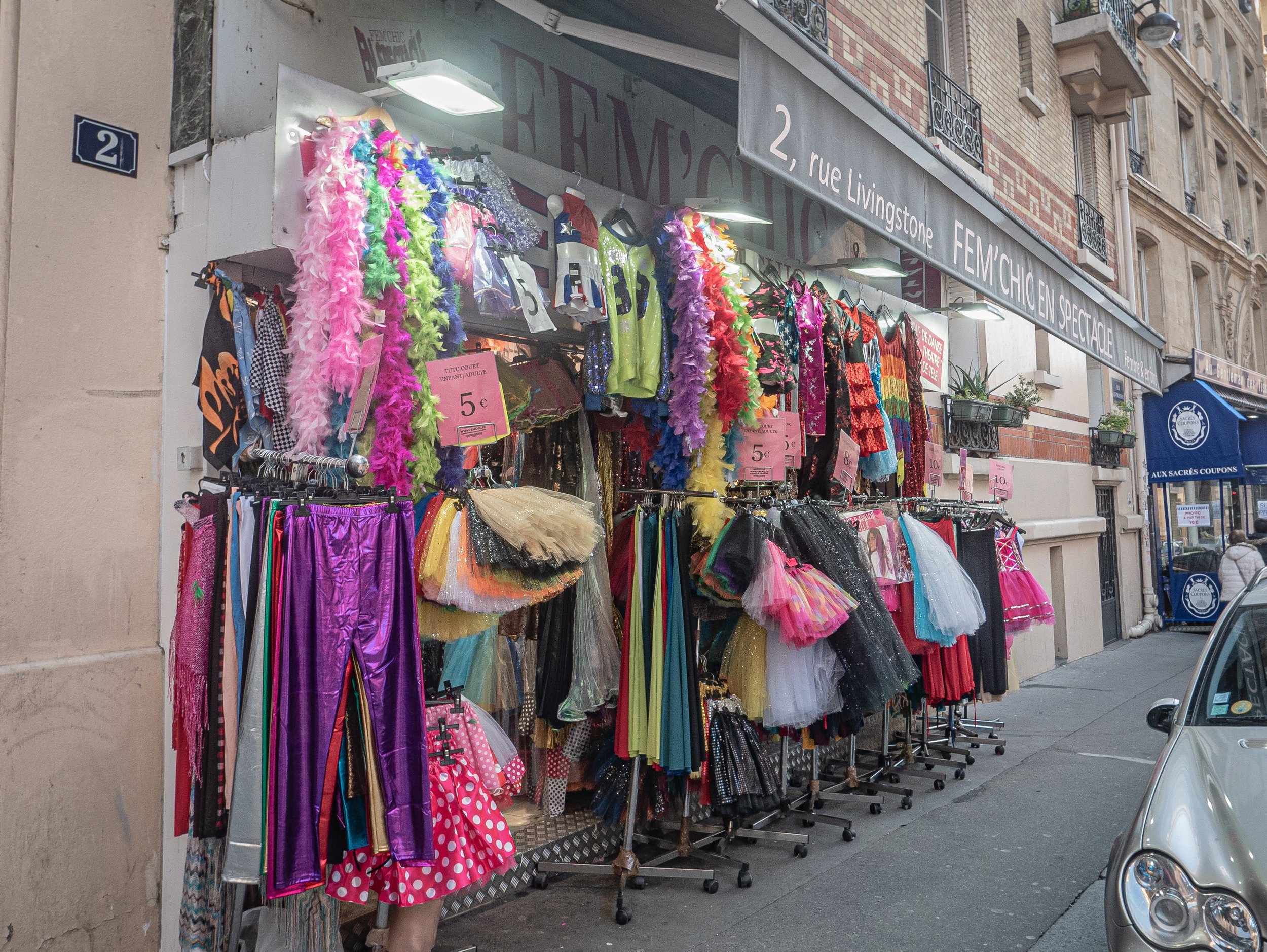
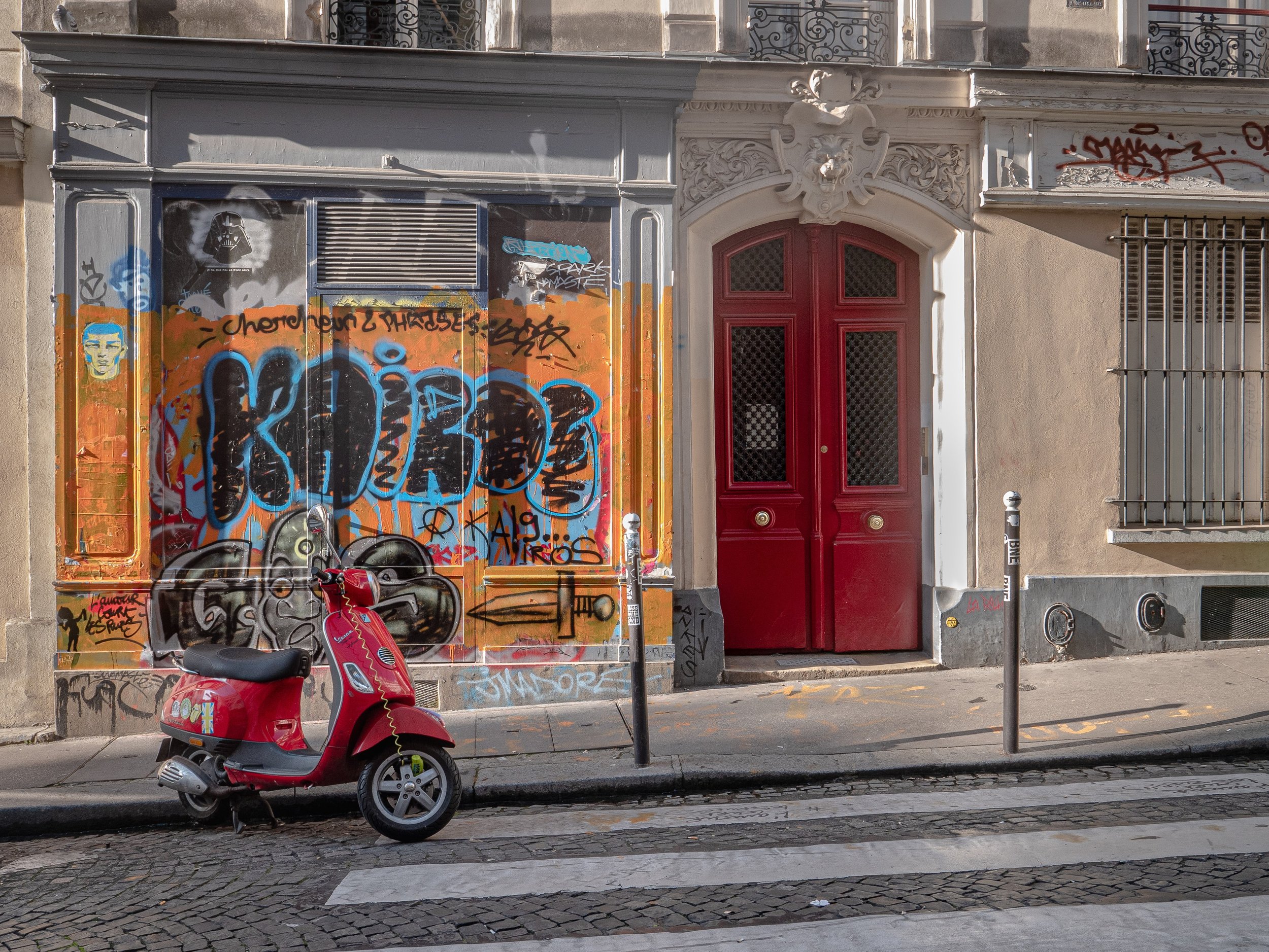
 The area appears to have been undergoing extensive change and the streets are starting in places to look quite shabby with a lot of graffiti - one of the few things that perhaps point to the area having an artistic heritage.
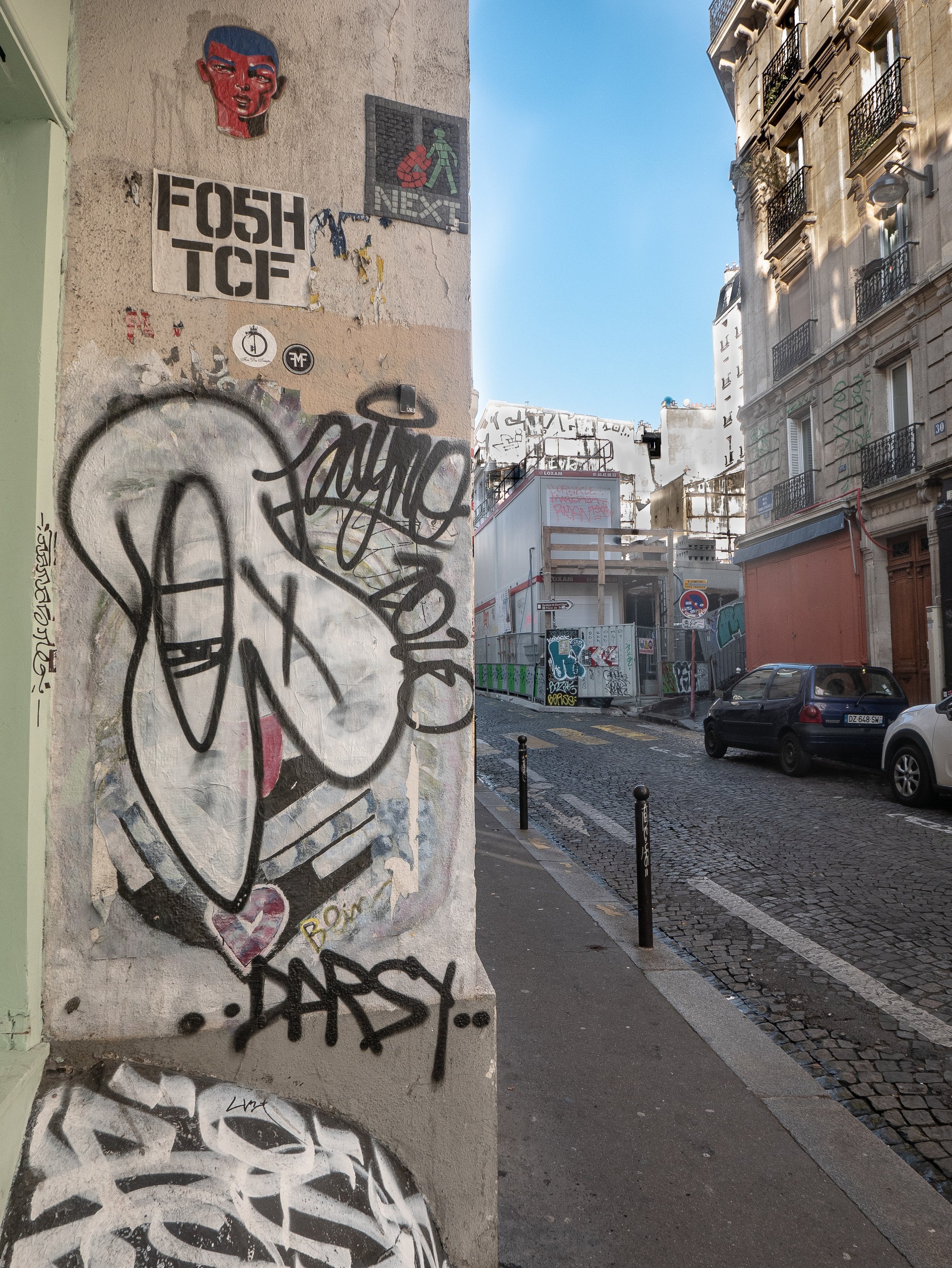
 In the daytime the steps leading up to Sacre Coeur quickly get very crowded, negating any sense of reverence for a site created for the purpose of religious devotion. This is exacerbated by the number of unlicensed street vendors trying to make a living by selling any number of cheap shiny plastic trinkets, predominantly Eiffel Towers and religious statuettes. The wider terraces are also populated with acrobatic breakdancing buskers using portable amplifiers and beat-boxes, a potential magnet for pick-pockets.
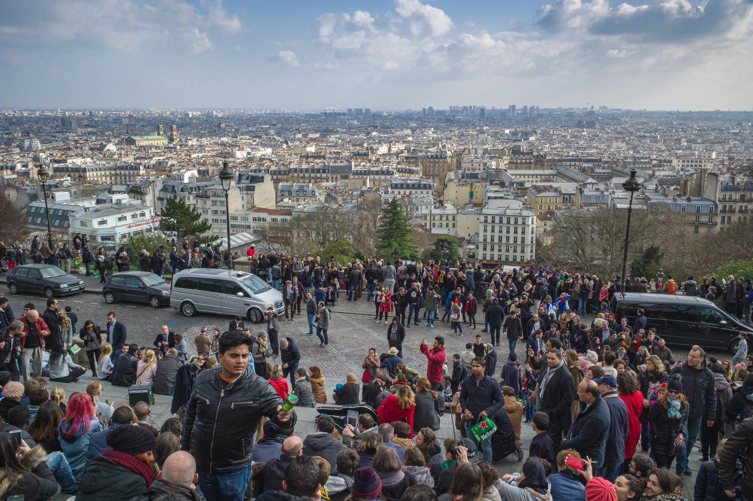
 In recent years, civil unrest and anti-government protests have featured prominently in news reports from France and the 'gilets jaunes' were in the process of setting up a small demonstration when I arrived, closely observed from a discrete distance by the police.
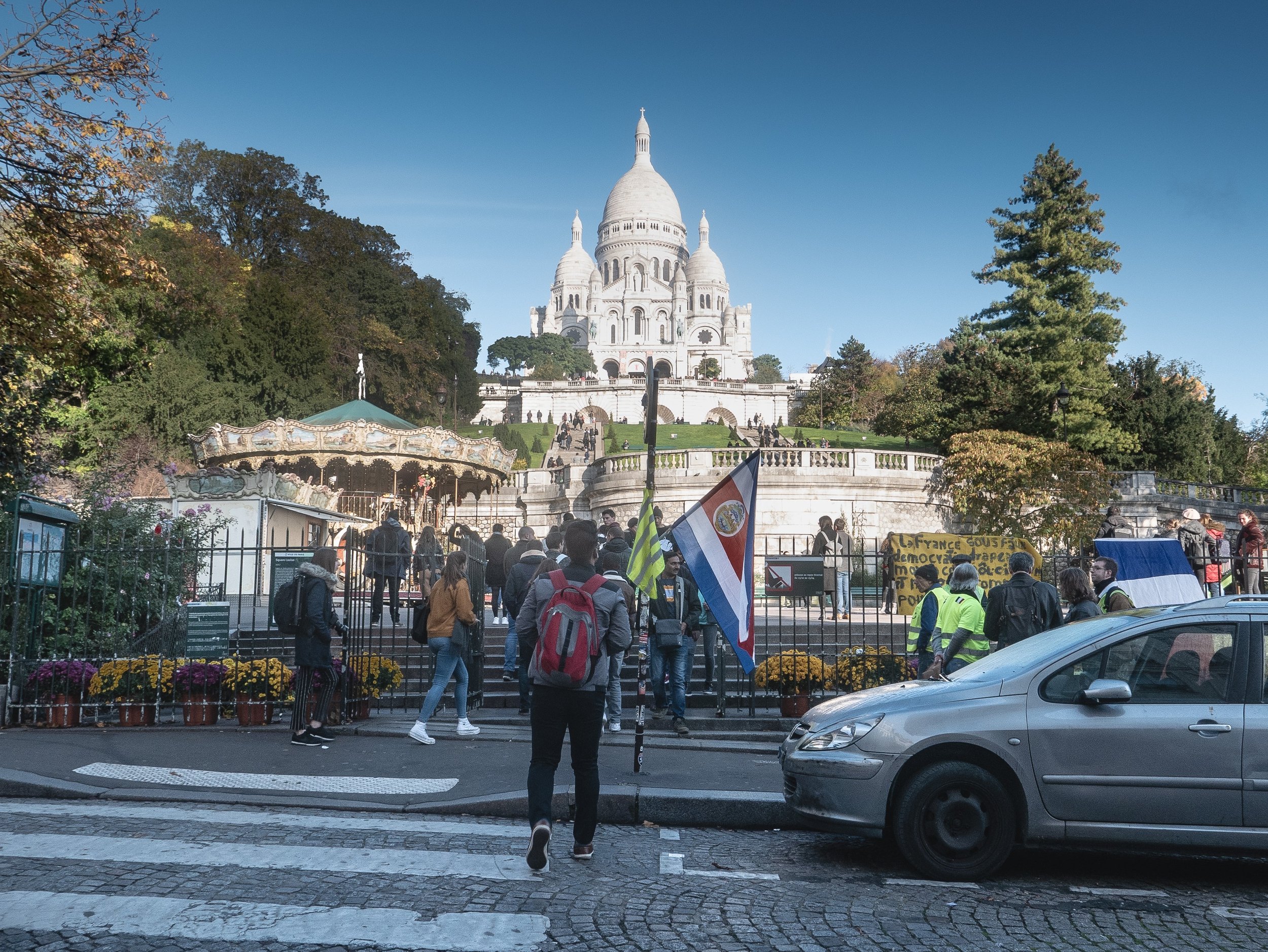
 That was when by pure chance, I arrived at the Halle Saint Pierre with a sign for an exhibition of photographs and artworks by Roger Ballen and I knew then what I was going to be doing for the rest of the morning.http://www.sacre-coeur-montmartre.com/english/

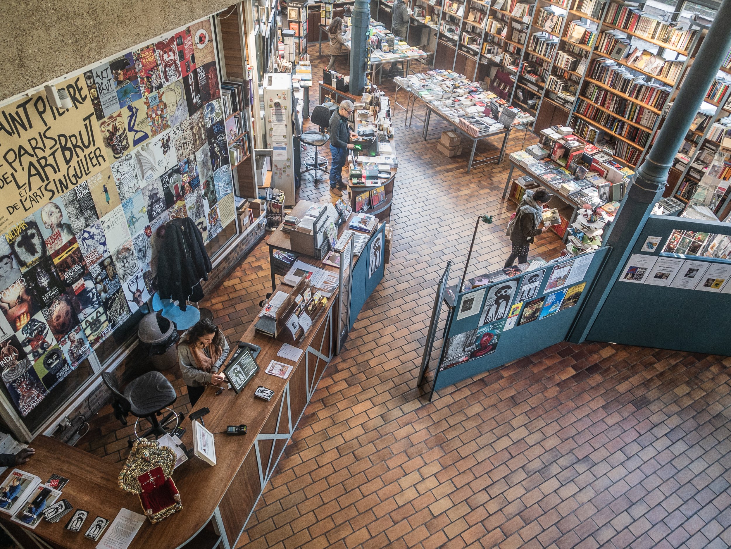
Paris Photo 2019
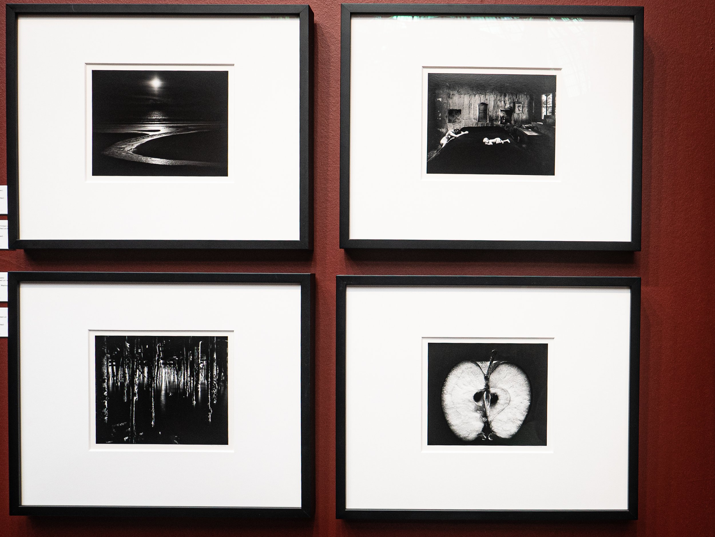
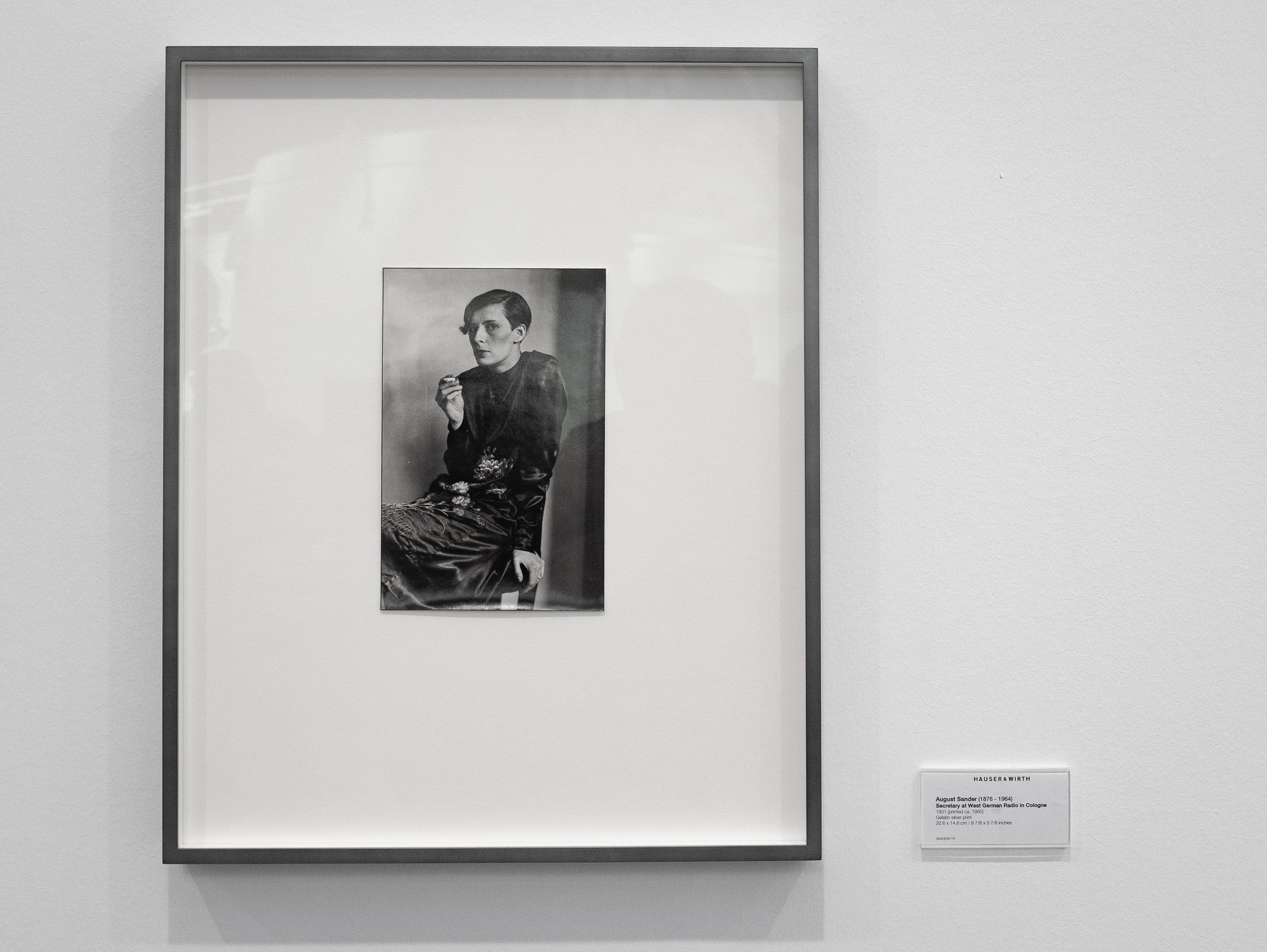
Spending a day at Paris Photo can be quite exhausting, due to the vast volume and wide range of photography on show but is one of the most stimulating ways of seeing at close hand, examples of a large selection of contemporary photography as well as original vintage prints by many of the finest photographers of the twentieth (and nineteenth) century. In practice, like Photo London, Paris Photo is essentially a four day long international dealers fair, showcasing largely fine art photography, with in addition a series of talks or interviews with several exhibiting photographers, a book fair and program of films, all under one (very large) roof.The large number of photographers represented makes it difficult to cover them comprehensively and unfair to single any one individual out. Selection of photos shown below represent a tiny fraction of what was available, concentrating on the more abstract or non-representational images, which I find myself increasingly drawn towards. They do not photograph well in the mixed lighting with lots of reflections and these are more of an aide memoire for myself and a record of the sorts of gallery layout that seemed effective, even in these relatively confined spaces. The selection includes a few original vintage prints by some of my personal favourites and several images by photographers that I have not previously encountered.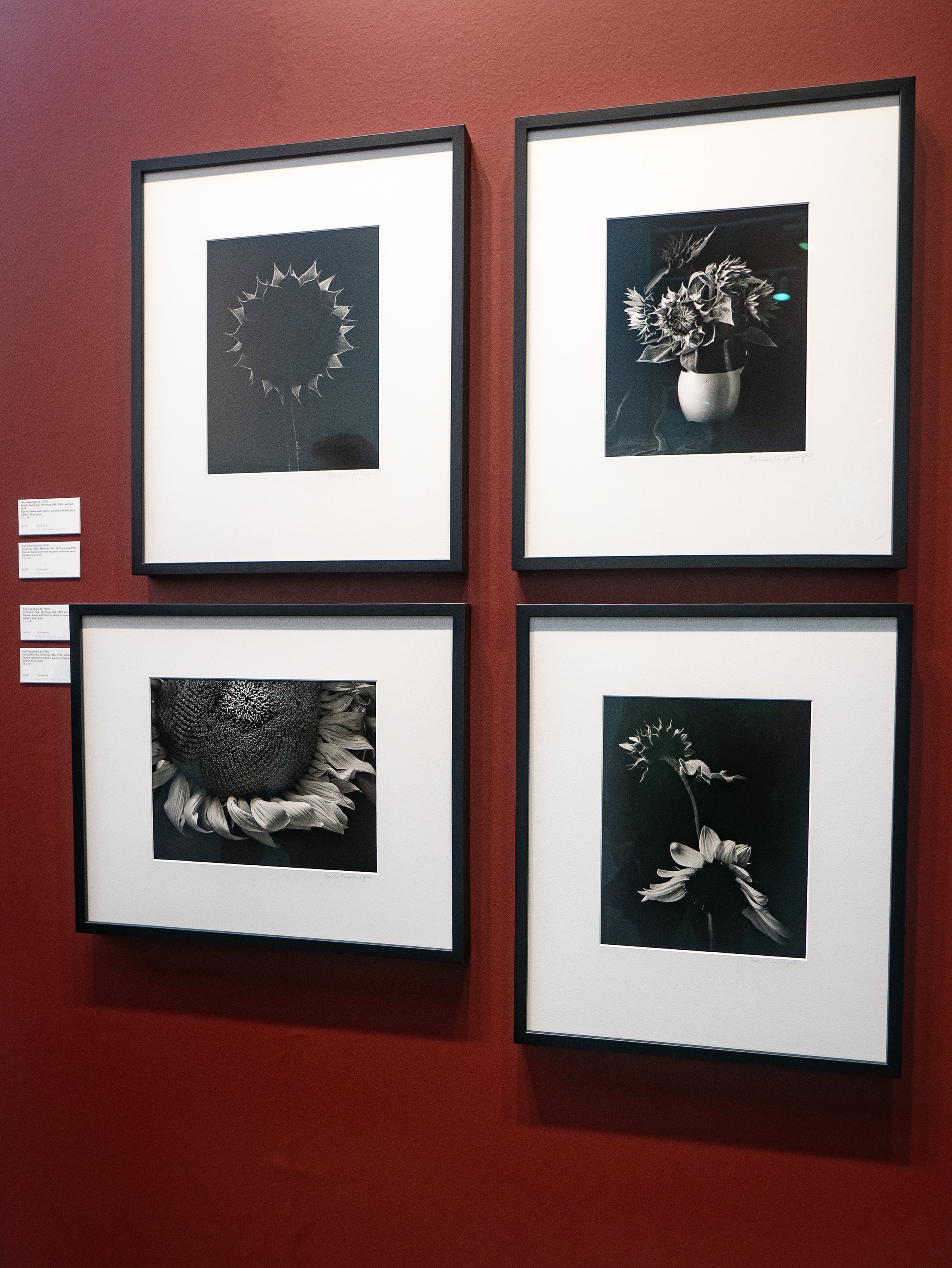
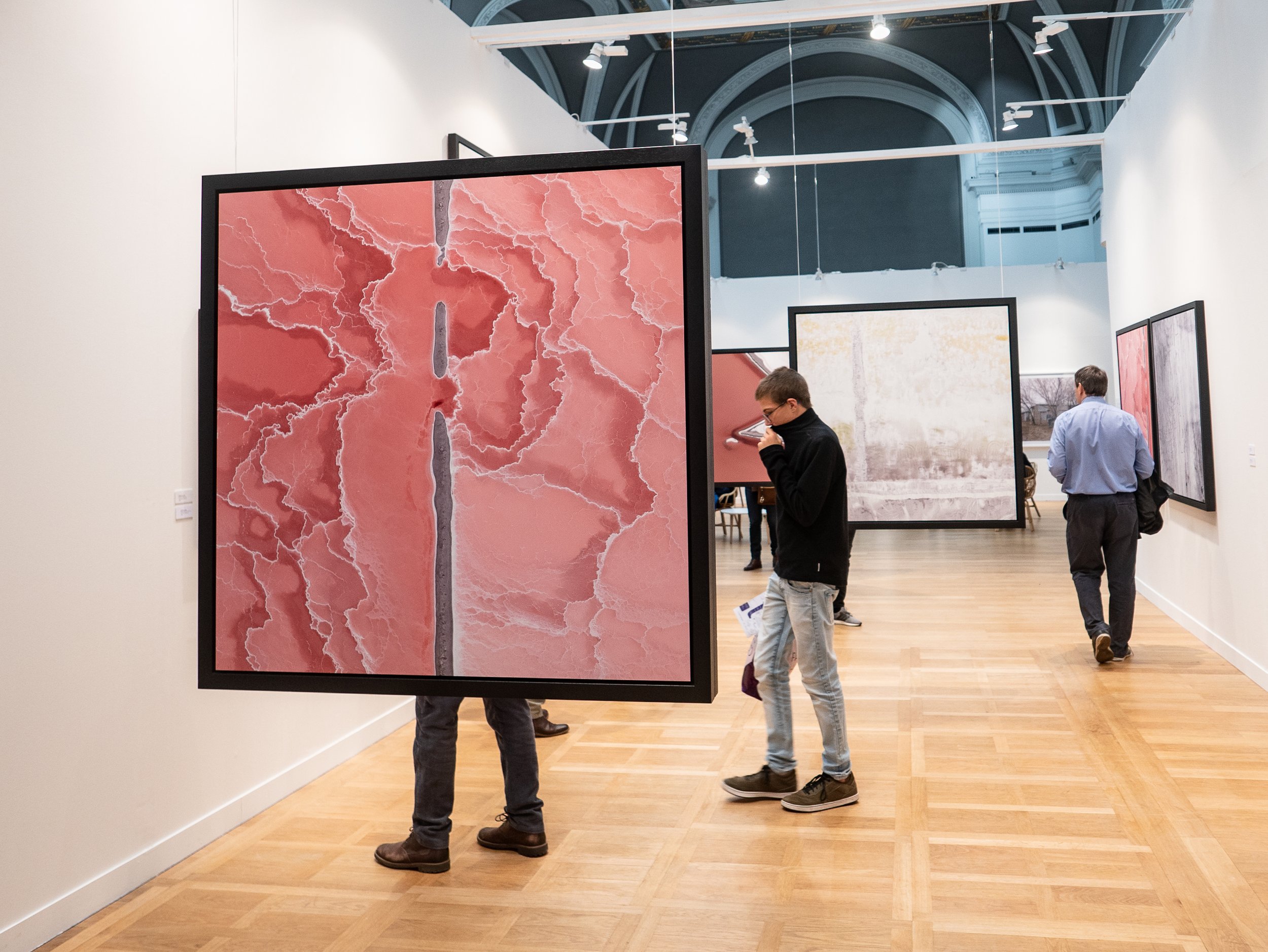
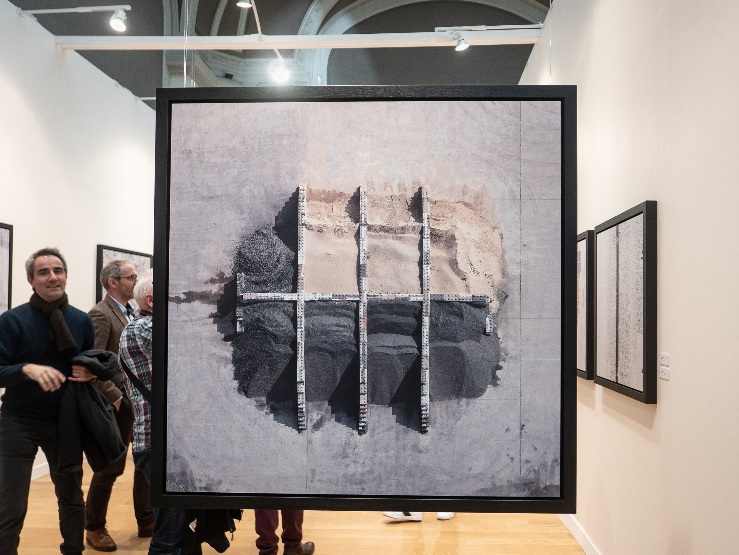 It was probably a mistake to try to see all of this in one day and the network of gallery stalls with a seething crowd of people actually makes it quite difficult to know if you have seen everything anyway. I spent seven hours going round the exhibits and tried to attend two of the Artist's Talks (one was in French a long way above my school days level), without stopping for a break as the queues for refreshment or food were enormous and I think I pretty much got there.
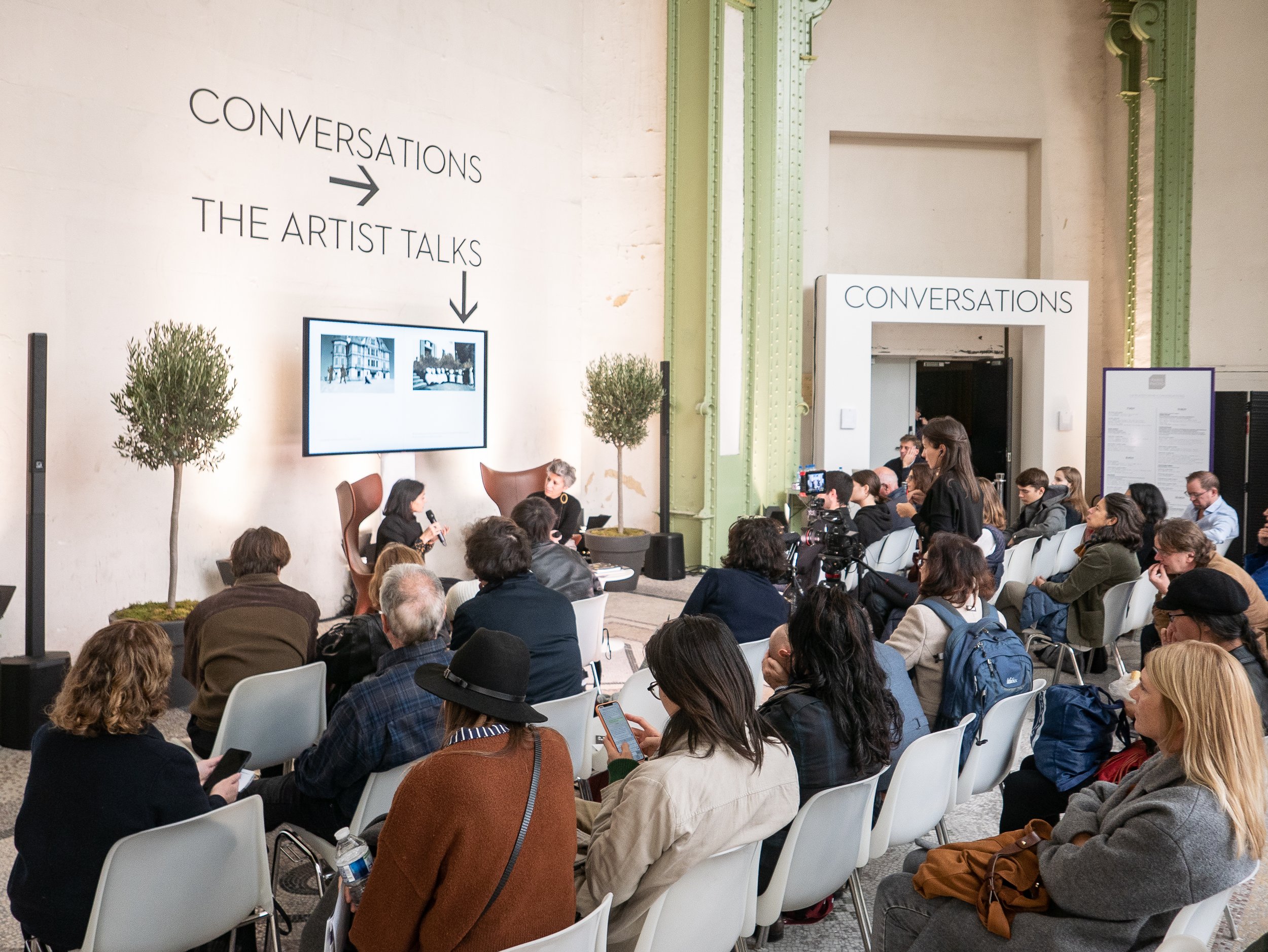 If I did go again I would plan to spend at least two days, plan ahead cherry-picking what I really wanted to see and make sure I get in early for a seat for any of the talks that I didn't want to miss. Although relatively poorly organised, the Paris Photo website is an excellent ongoing resource with videos of many of the interviews from this and from previous years.https://www.parisphoto.com/en/Home/
'As it is' - a Zed Nelson film with David Hurn at work in the Welsh landscape
On 16th October 2019, Oriel Mostyn in Llandudno presented the first showing of 'As it is', a new short film by Zed Nelson in collaboration with Magnum photographer David Hurn, followed by a talk and question and answer session with Zed Nelson and Alfredo Cramerotti, Director of the gallery. This was combined with the opening of an exhibition of small selection of David Hurn's photographs, about ten each from his earlier monochrome work on street life in Wales and from his current project documenting the ongoing changes in the landscape of Wales. The film documented Hurn in the process of making these more recent images while in conversation with Zed Nelson, in which he described his approach to the project.Hurn is not generally regarded as a landscape photographer and acknowledged that at the age of 85, this could appear to be a change of genre from his better known largely monochrome documentary photography but explained that the aim of this work is to document the landscape 'as it is' currently, with particular emphasis on the effects of human habitation and exploitation rather than its' natural beauty. Each scene in the film was based on the thought processes going into the making of a specific individual photograph, several of which were made locally in North Wales.The conversational approach and clear rapport between the two photographers made the film enjoyable to watch as well as informative. The Q and A session which followed was quite lively and largely positive though one person questioned the use of the title on the basis that the photographs represent David Hurn's (masculine) views on the state of the Welsh landscape as he sees it rather than 'As it is'. Hurn has been quoted as saying he regards the concrete structures in the breakwater shown above as "one of the two best sculptures in Wales". From my own point of view, the most obvious criticism is the fact that the exhibition of such an important photographer's work was located in a small side gallery and consisted of such a disappointingly small number of his photographs.https://www.mostyn.org/event/exhibition-opening-event-film-screening-artist-talkImage copyright: David Hurn/ Magnum Photos. Sourced on 30/10/2019 at: https://www.canon-europe.com/pro/stories/david-hurn-documenting-landscapes/
A masking frame for photograms
The challenge of accurate alignment of objects on a sheet of colour photographic paper and masking areas for multiple different exposures in total darkness, demands the assistance of a suitable tool for the job. Commercially available darkroom masking frames are designed perfectly to hold a single sheet of paper flat but have no mechanism for ensuring the precise location of three dimensional objects or re-positioning them for further exposures. I felt this called for a tray design, with shallow sides and removable blocks of different sizes to create the spacing for the commonly available colour print papers I use, 16 x 12 in., 12 x 9.5in and 10 x 8 in. The design I came up with used a sheet of MDF and strips of 10mm thick and 25mm (approximating to 1 inch) wide timber cut to several lengths and painted matt black to minimise reflections. The outer fixed strips have been fixed with adhesive to create a base with internal dimension of 16 x 12 inches. The inner removable strips vary in size from 6 to 12 inches in length, with one 12 inch strip halved lengthwise for the 9.5 inch paper.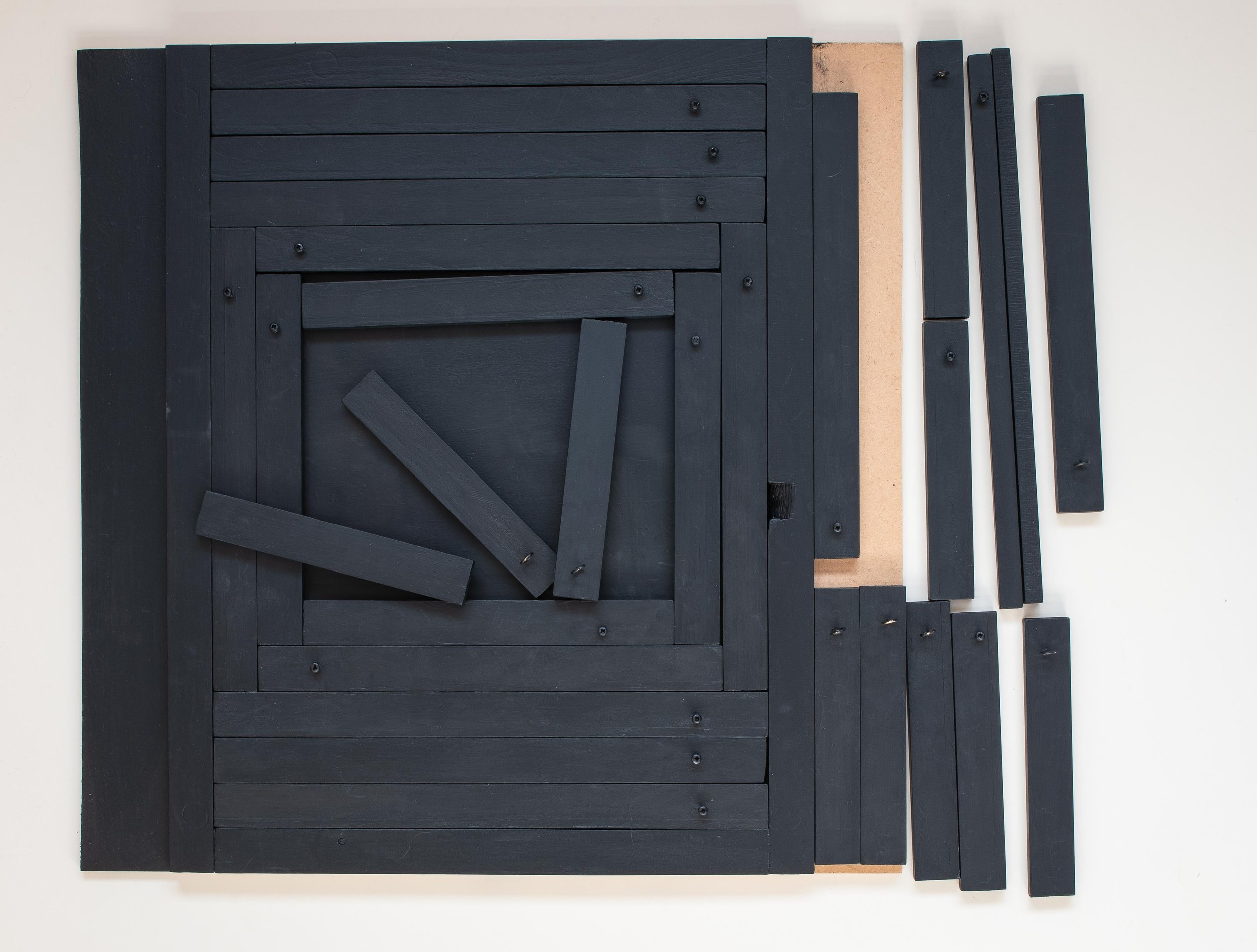 One inch is more precisely 25.3mm and allowing for the thickness of two coats of paint (and my very limited woodworking skill-set), the jigsaw of pieces fits together reasonably efficiently. A few small gaps are inevitable however and stray narrow shafts of light should get through unpredictably frequently enough to leave room for serendipity to have an effect. The paintwork needs a few more days to harden and then it will be time to get back in the darkroom to find out how well it works.

Generating interest in plastic waste
 In trying to highlight the more serious issues created by careless disposal of waste plastic much of which ends up in the sea, I have attempted to make photographs of waste plastic on beaches but felt that most of the images were disappointingly ineffectual (boring). The image above and the featured image were made at Traeth Cymyran on Anglesey a few weeks after a storm at Holyhead harbour destroyed the pontoons in the marina which used blocks of polystyrene for buoyancy, spreading fragments like that in the photograph for many miles along the coast. A huge variety of non-biodegradable materials are washed onto beaches, even in the most remote areas, like the island off the Atlantic coast of the North West of Ireland in the example below.
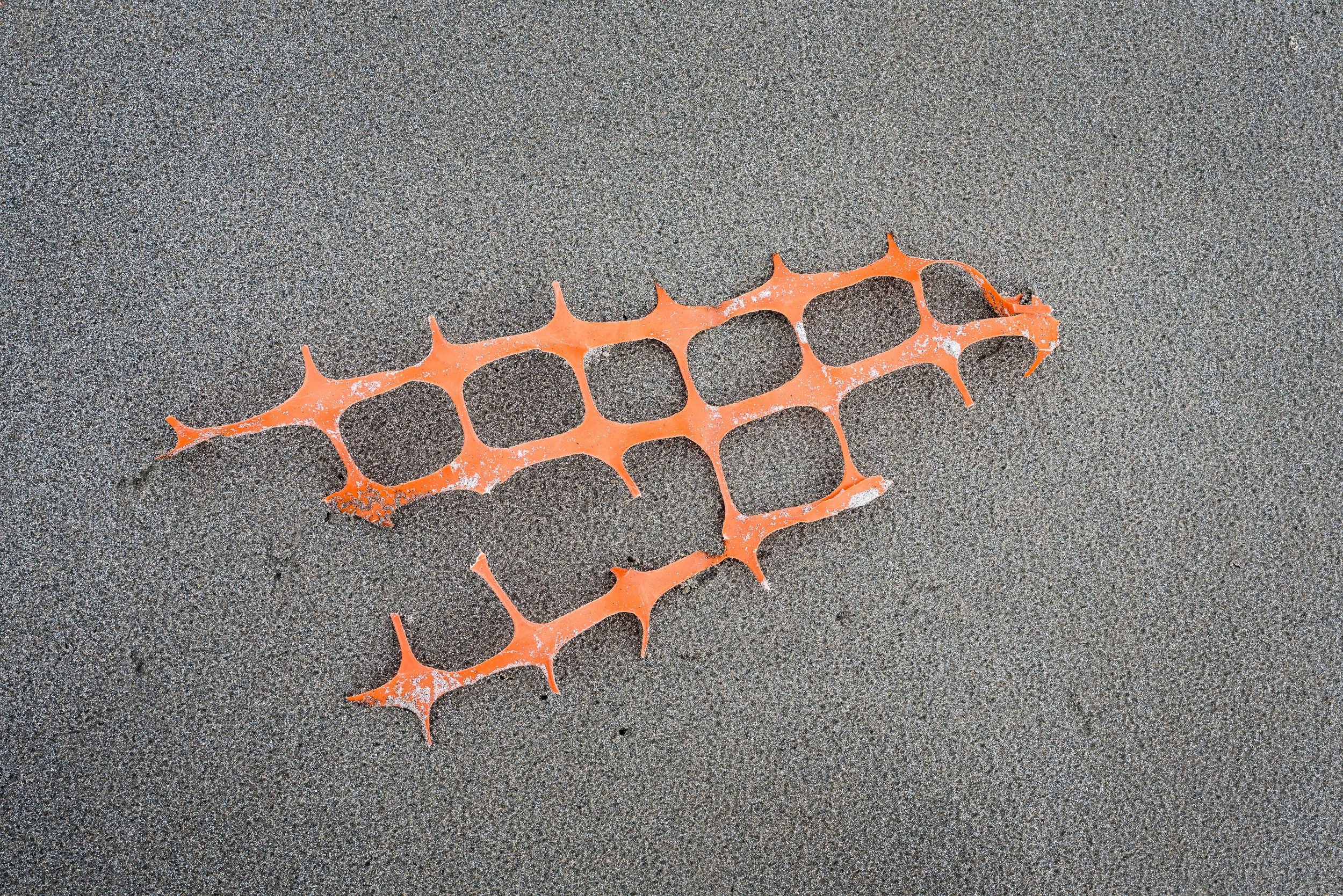 I have followed with interest, the amount of media coverage recently given to the environmental impact of waste plastic and one contemporary photographer who has published several very effective bodies of work in this area, is Mandy Barker (born 1964). In an extensive interview with Mike Simmons in 'Photographers and Research', she explained that she also initially tried to make her photographs in situ, where it washed up on the beach but felt that the familiarity of these images resulted in people being unlikely to engage with them. She found that by taking the objects into the studio and photographing them in saturated colour against a solid black background, she could create the impression of an alien life form deep in the sea, suspended underwater. For her first series 'Indefinite' she used solitary objects but in her subsequent projects 'Soup' and 'Shoal', she used digital montages of multiple samples of plastic objects collected from beaches, varying their size in the image to create an impression of perspective depth and positioning them in ways which mimicked the circulation of underwater currents.The other element which adds impact to her images is her use of imaginative captioning, giving viewers limited but factual contextual detail; sometimes a grid reference, sometimes an indication of the type of plastic debris or how long it would take to degrade. She also went to great lengths to ensure the accuracy of her information, by collaborating and making extensive field trips with oceanographic scientists and has presented her photographs at prestigious ecology conferences. For a series of images titled 'PENALTY', made to exploit the publicity surrounding the 2014 F.I.F.A. World Cup, she used a social media call-out for donations from the public, to collect and photograph 769 plastic footballs collected from 144 beaches in 41 countries around the world.A retrospective of her work is currently on show at the Royal Photographic Society in Bristol and 'Beyond Drifting' her most recent series of photographs, is featured this month in Black and White Photography magazine. These abstract monochrome images are captioned with pseodo-Latin species names and framed in a circular mount, to mimic the appearance of photographs of plankton taken using a microscope but are in reality plastic debris, flowers, toys, tricycle wheels, a Barbie dolls arm and a plastic yoke from a six-pack. In the accompanying article she explains that the images were taken with old film cameras on out-of-date grainy film, with movement blur which on the first occasion, occurred when in the darkness of her studio, she inadvertently knocked into the tank in which they were suspended during a long exposure, a 'happy accident' which she quickly recognised and exploited to make the rest of the series.Her work has moved on a long way from the simple photographs of artifacts on the beach demonstrating the value of her extensive research, her collaborations with experts in the field and her willingness to experiment with different formats to produce photographs of plastic waste, which are powerful enough to draw in viewers and in the process encourage them to engage with an issue of serious significance.
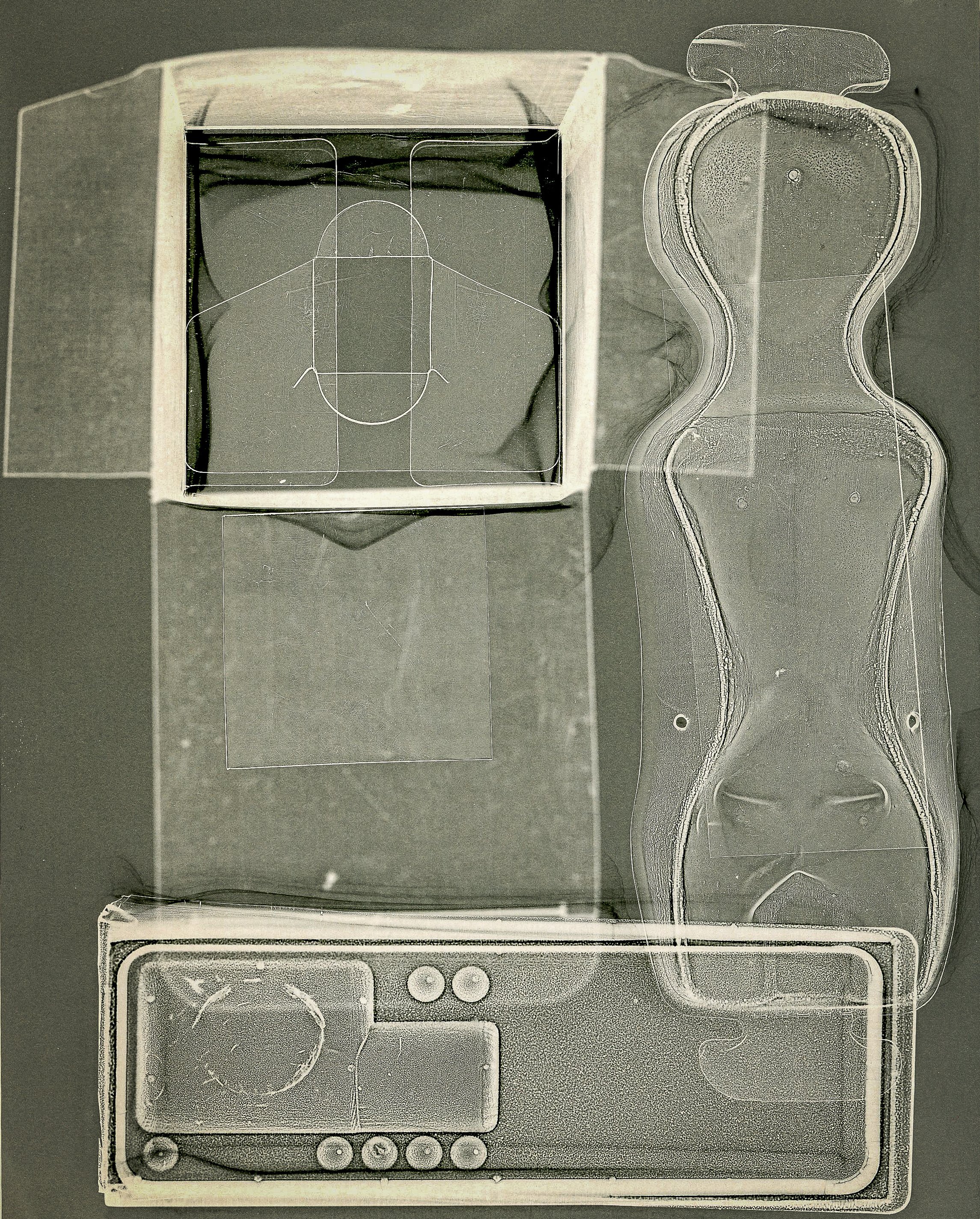 I have been making close-up photographs of the textural detail in waste packaging intermittently for several years. My original motivation for this was simply the challenge of trying to find something aesthetically pleasing in a mundane subject, which would not normally be considered as 'photogenic'. I also enjoy using isolation of detail, distortion of scale or unusual lighting to create something ambiguous, leaving the viewer unsure of what they are looking at. The fact that clear or translucent forms of packaging are very effective materials for creating photograms in the darkroom was a fortuitous coincidence, which has taken my own work in a potentially more interesting direction. Could this be an alternative approach to raising awareness by investigating the factors, other than their contents and practical convenience, which attract consumers to continue using them.Barker M (2019). 'Mandy Barker Photography' (Photographers website), Accessed on 2 May 2019 at: https://mandy-barker.com/Calder T (2019). 'Beyond Drifting' (Interview with Mandy Barker). Black and White Photography, Lewes East Sussex; Guild of Master Craftsman Publications. Issue No. 229, pp 28 - 35.Royal Photographic Society (2019). 'Mandy Barker: Altered Ocean Exhibition', Open: 4 April - 23 June 2019. Location: RPS House, Bristol. Information Accessed 2 May 2019 at: www.rps.org/exhibitions-and-competitions/mandy-barkerShukman D (2019). 'Plastic in the Ocean' (BBC iplayer film), Accessed on 14 April 2019 at: https://www.bbc.co.uk/programmes/p069vjw6Plastic-in-the-OceanSimmons M (2017). 'Case Sudy: Mandy Barker'. In: Read S and Simmons M 'Photographers and Research', Abingdon Oxon. and New York, Routledge, pp 126 - 139.

A happy accident
It is expected that a competent photographer should be capable of producing carefully exposed, precisely focused, technically perfect images. Learning the skills set required to master the controls of the camera can lead to a fixation on exposure and sharpness, a constant imperative that this must be done 'correctly', which in turn may constrain the development of personal visual expression (Ulrich, 2018). One way of balancing these conflicting processes, arriving at an equipoise between obsession with technique and freedom of expression, could be to concentrate on the basic elements, defined by Angela Faris Belt as constituting the 'grammar of photographic language'; framing and borders, quality of focus (using lenses and apertures to control depth of field), time and motion (determined by shutter speed) and the physical media used to present the final image (Belt, 2008).Patricia Townsend discusses this in her essay in 'Photographers and Research', stressing the importance of being able to respond to all aspects of the medium (camera, processing of film, digital process, printing technique or darkroom equipment), and then listen to what the medium has to 'say'. In the essay, she quotes photographer Liz Rideal as follows: "it's about the happy accident but it's also about recognising something when it's coming to the surface" (Townsend, 2017). The photogram below could be considered as and example of an accidental discovery arising from the challenge of working with colour photographic paper, which being polychromatic has to be handled in complete darkness. I was attempting to produce an image with a single plastic insert, using a seemingly 'simple' makeshift masking technique with scrap cardboard, to make four separate exposures and create a futuristic grid like structure. I gave up when it proved impossible to align the plastic accurately in the dark and the cardboard masks kept slipping between exposures.
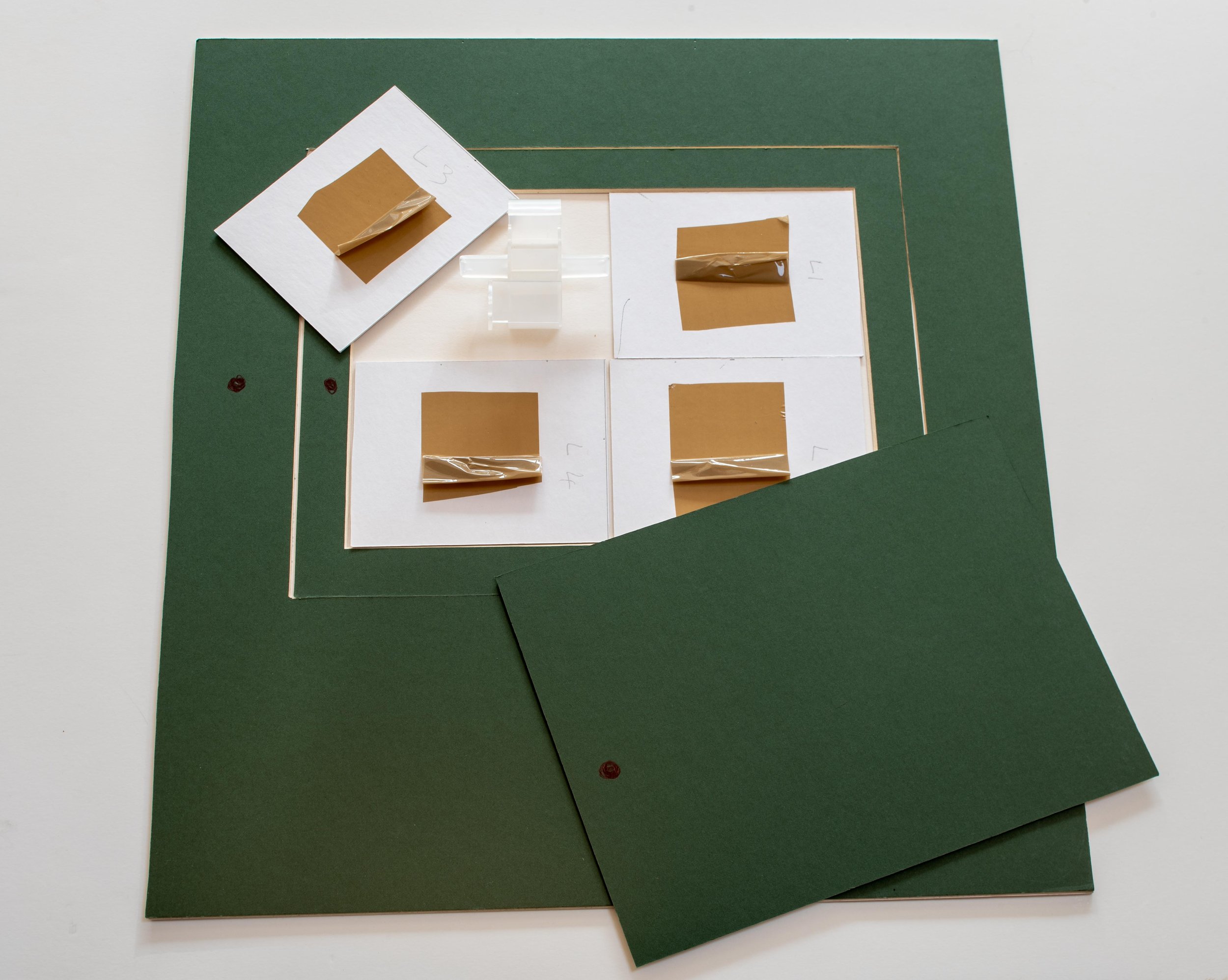 On reviewing the dried prints the following morning, I realised that the randomly overlapping placement of the card and the plastic insert had produced different levels of exposure (particularly in the bottom right hand corner), creating unexpected shapes with different tones of the same colour. The resulting image is almost certainly more interesting, than it would have been if the technique had worked 'correctly' and I now know (roughly) how to repeat the effect.Psychoanalysis has identified that the freedom to be creative is dependent on the ability to enter a state of mind which is similar to that found in children (and adults) engaging in uninhibited play (Winnicott, 1971). Is it possible to create these happy accidents or do we have to keep working, trying to find ways around the limitations of our processes and materials and hope that we can recognise them when they eventually come along?Belt A F (2008). 'The Elements of Photography'. Oxford; Focal Press (Elsevier Inc.), p XIX.Townsend P (2017). 'Between Inner and Outer Worlds'. In: Photographers and Research, ed. Read S and Simmons M; Abingdon, Oxon., Focal Press (Routledge). pp 211-212.Ulrich D (2018). 'Zen Camera'; New York, Watson-Guptill Publications, p 140.Winnicott D W (1971). 'Playing and Reality'. Abingdon, Oxon., Routledge. p 71.
Colour theory - Itten and Albers
Two of the most influential texts on colour theory were written in the 1960's by two men with similar backgrounds but very different approaches to the subject. Both by that stage had recently retired from distinguished teaching careers to concentrate on being working artists, Johannes Itten (1888-1967) having been Director of the Museum of Arts and Crafts in Zurich and Josef Albers (1888 -1976), Chair of The Department of Design at the Yale University School of Art in Connecticut. Both men had strong connections with the Bauhaus School in Weimar Germany. Itten developed and ran the Preliminary Course which was compulsory for all first year students from its inception in 1919 until he fell out with Walter Gropius in 1923 and moved to Berlin to start his own school of design. He moved briefly to the Netherlands in 1938 before returning home to Switzerland later that year (Art Directory Gmbh, 2019). Having enrolled initially in 1920 Albers was the first Bauhaus student to join the teaching faculty as a Master in the glassmaking studio, at the time the school moved to Dessau in 1925. When the National Socialists came to power in Germany in 1933 and the Bauhaus finally closed, he and his wife were invited to establish the inaugural visual arts course at the Black Mountain College in North Carolina (albersfoundation.org, 2019). 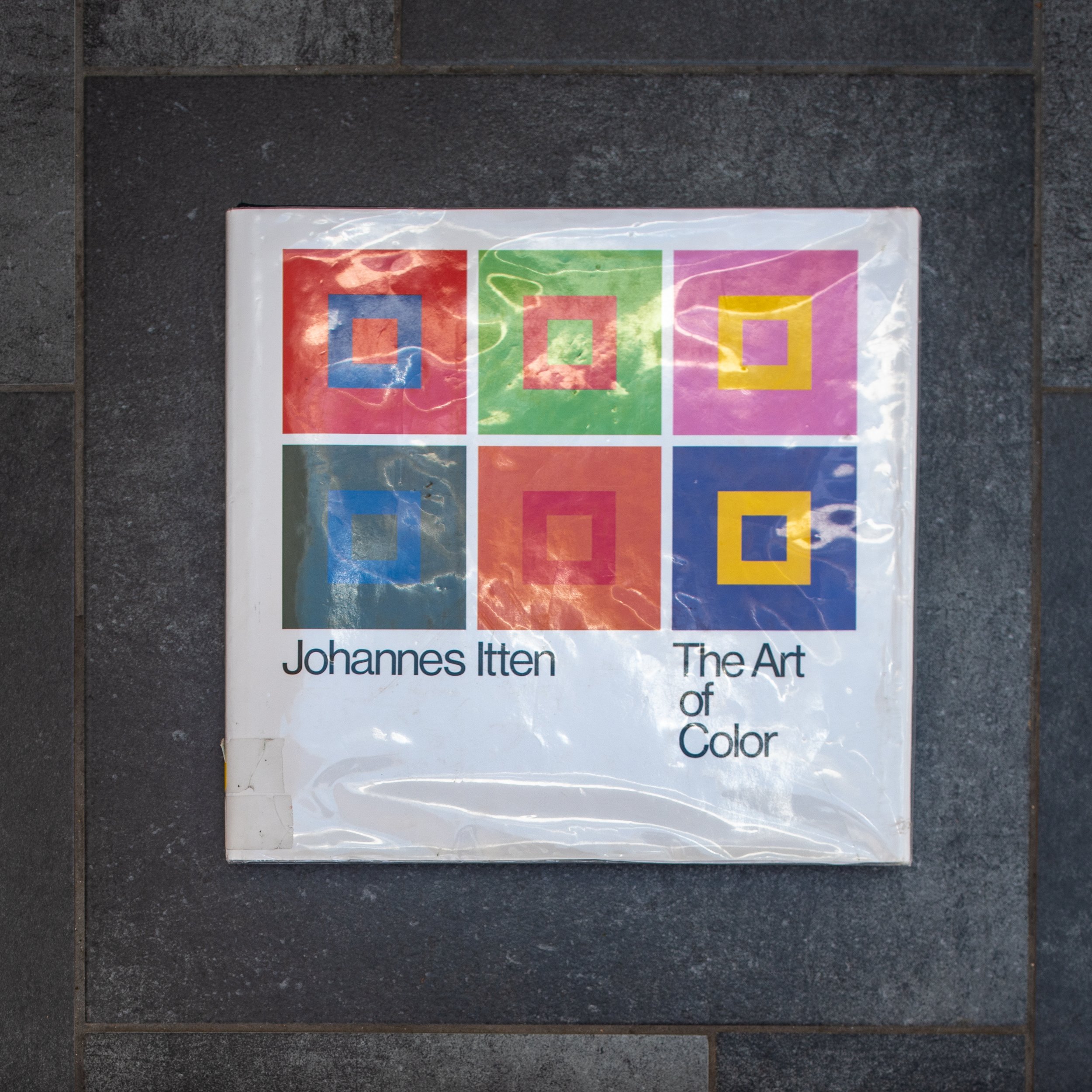 On first impression Art of Color : The subjective experience and objective rationale of color by Johannes Itten has the look and feel of a beautifully illustrated traditional large format textbook. The early chapters explain colour physics, with brief descriptions of the colour spectrum, the light forming wavelengths of electromagnetic radiation which are focused via the optical mechanism of the eye (cornea and lens) to be captured by the photosensitive cells in the retina (the sensor), then transmitted to the optical cortex of the brain to be perceived as a continually refreshed image. Subsequent chapters move on from these objective principles to his own theories (expanding on earlier work by Adolf Holzel with whom he had trained in Stuttgart), which explore how our subjective perception can be influenced by emotional and symbolic factors in combination with the visual interactions of complementary and contrasting colours (bauhaus100.com, 2019). "Color perception is the psycho-physiological reality as distinguished from the physio-chemical reality of color" (Itten, 1963). His explanations of the significance of these phenomena are illustrated by reference to a series of paintings ranging chronologically from eighth century religious paintings, through the work of the European old masters, to the abstract modern art of Klee (a fellow Master in the Bauhaus teaching faculty), Mondrian and Picasso. The book is worth reading for these comprehensive insightful explanations alone.The approach taken by Albers in the more modest looking Interaction of Color is that of a practical course manual for students in a colour theory classroom, presented as a series of exercises using swatches of coloured papers, designed to demonstrate rather than simply describe how interacting colours are perceived. The illustrations linked to each chapter are presented separately from the exercises, the aim being that students should first try to reproduce them for themselves, presumably as a more effective way of learning. Many of the exercises recreate apparent optical illusions (colour deceptions) but in doing so, provide rational explanations for complex phenomena and like Itten, demonstrating that "in visual perception there is a discrepancy between physical fact and psychic effect" (Albers, 1963). His demonstrations of the use of the effect of colour intensity (brightness) to show how an identical swatch of colour is perceived differently depending on the background it is placed against (page 8) and the phenomenon of the after image (page 22) are simple but remarkably effective.
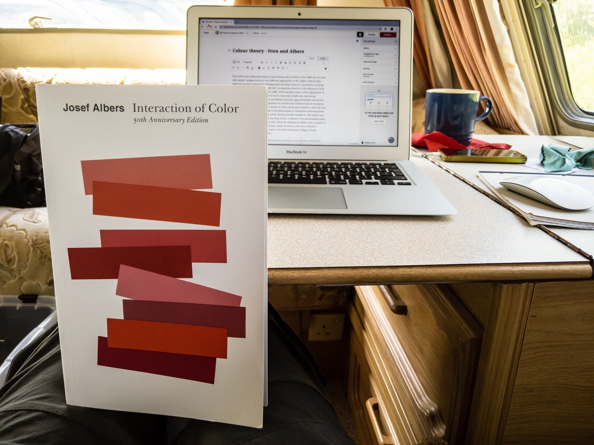 I am working my way through both of these books at present and am only just beginning to get to get to grips with the subject. The featured image below is my digital photograph of a step in a bathroom ceiling which is painted entirely white.
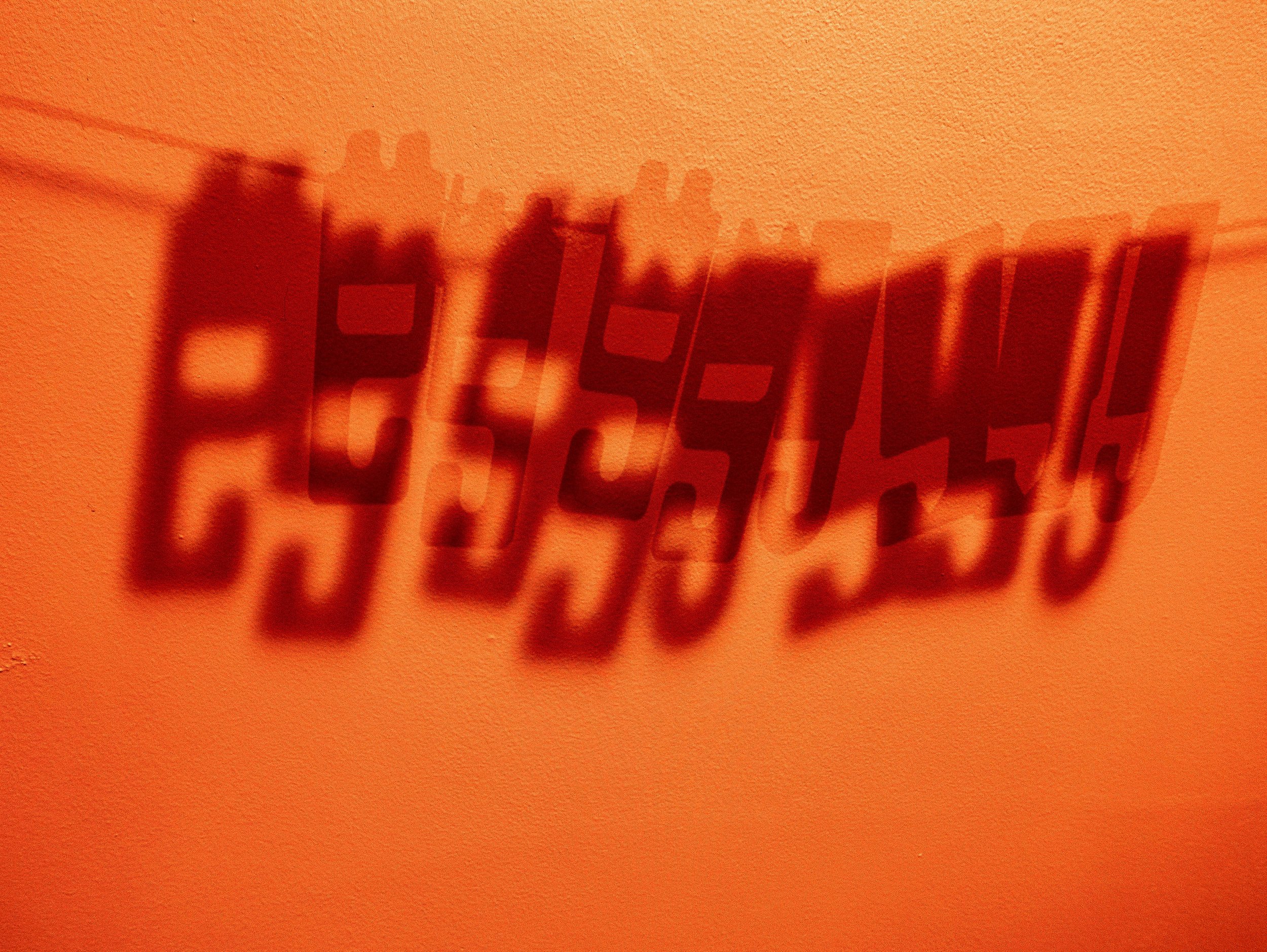
 The colours have been produced through manipulation of the RAW file in Adobe Photoshop Lightroom, simply by accentuating (albeit grossly) the existing colour casts in the image. The sunlit area is warm in tone, producing the primary colour yellow when enhanced, while the tone of the area in shadow is cool forming the complementary blue when accentuated. These casts are barely perceptible in the original photograph and not normally 'seen' by the naked eye as, knowing that the paint is white, our brain 'corrects' this for us. Photographers working in colour, in trying to obtain colours which are true to life, usually correct these casts when they become apparent. This experiment for me suggests that in reality the colours are already there, which would mean that in striving to obtain tones which will be perceived as 'true', we may in fact be perpetrating a deception. Albers J (1963). 'Interaction of Color'. New Haven, Yale University Press. (My edition of this is the Fiftieth Anniversary (4th) Edition of the paperback version, still in print and published in 2013)albersfoundation.org (2019). Josef and Anni Albers biographies. Online, Accessed 27 April, 2019 at: www.albersfoundation.org/artists/biographies/Art Directory Gmbh (2019). Johannes Itten Biography. Online, Accessed 2 May, 2019 at: www.johannes-itten.combauhaus100.com (2019) Johannes Itten. Online, Accessed 2 May 2019 at: https://www.bauhaus100.com/the-bauhaus/people/masters-and-teachers/johannes-itten/Itten J (1973) 'Art of Color : The subjective experience and objective rationale of color'. New York, John Wiley and Sons Inc. (first published in Germany in 1961 by Otto Maier Verlag)
Royal College of Art : Colour Reference Library
For future reference - a useful link for potential access to primary and secondary research material on colour theory. According to the RCA website it is 'one of the largest and most comprehensive collections of colour-related materials in the world', covering art, science, theory and practice and consisting of books, pamphlets, colour swatches and journals. In the oversize collection, they have a copy of Josef Albers' Interaction of Color, in its original edition from 1963 with full size silk-screen plates.RCA Special Collections is housed in a purpose built archival storage storage facility with a temperature controlled environment, on the top floor of the Library in the Common Room Block of the Royal College of Art, Kensington Gore, London, SW7 2EU. Access is open to all bona fide researchers (I.D. required) by appointment only through email at special-collections@rca.ac.uk or by telephone +44 (0)20 7590 4234. https://www.rca.ac.uk/more/special-collections/special-collections-books/colour-reference-library/Featured image: Digital photograph of my darkroom wall (shadows of drying line with film clips)

Fingertips in Time - John Hedley
The painter and printmaker John Hedley gave a talk on the work in his exhibition 'Fingertips in Time' at Oriel Colwyn on Thursday 7th March 2019. The exhibited images fall into two series, one of trees presented as monochrome prints which looked almost like charcoal sketches and the other, a series of multicoloured print studies of volcanic rock formations from two sites, one at Llandwyn Island on Anglesey and the other in Crete. John talked about the techniques he used in making these and also more extensively about his work in general including his paintings, sculpture and work with mixed media. My interest in his processes relates to his use of digital camera photographs as the starting point and how he went about transforming these into intaglio prints. He explained that he prints the photographs as a positive image at high resolution (600 dpi bitmapped) onto acetate, using an A3 inkjet photo quality printer. The acetate is then exposed in a UV light box (Natgraph) onto a photopolymer etching plate (Solar Plate), which when processed and prepared (polished) can be inked up for printing onto dampened paper in a press.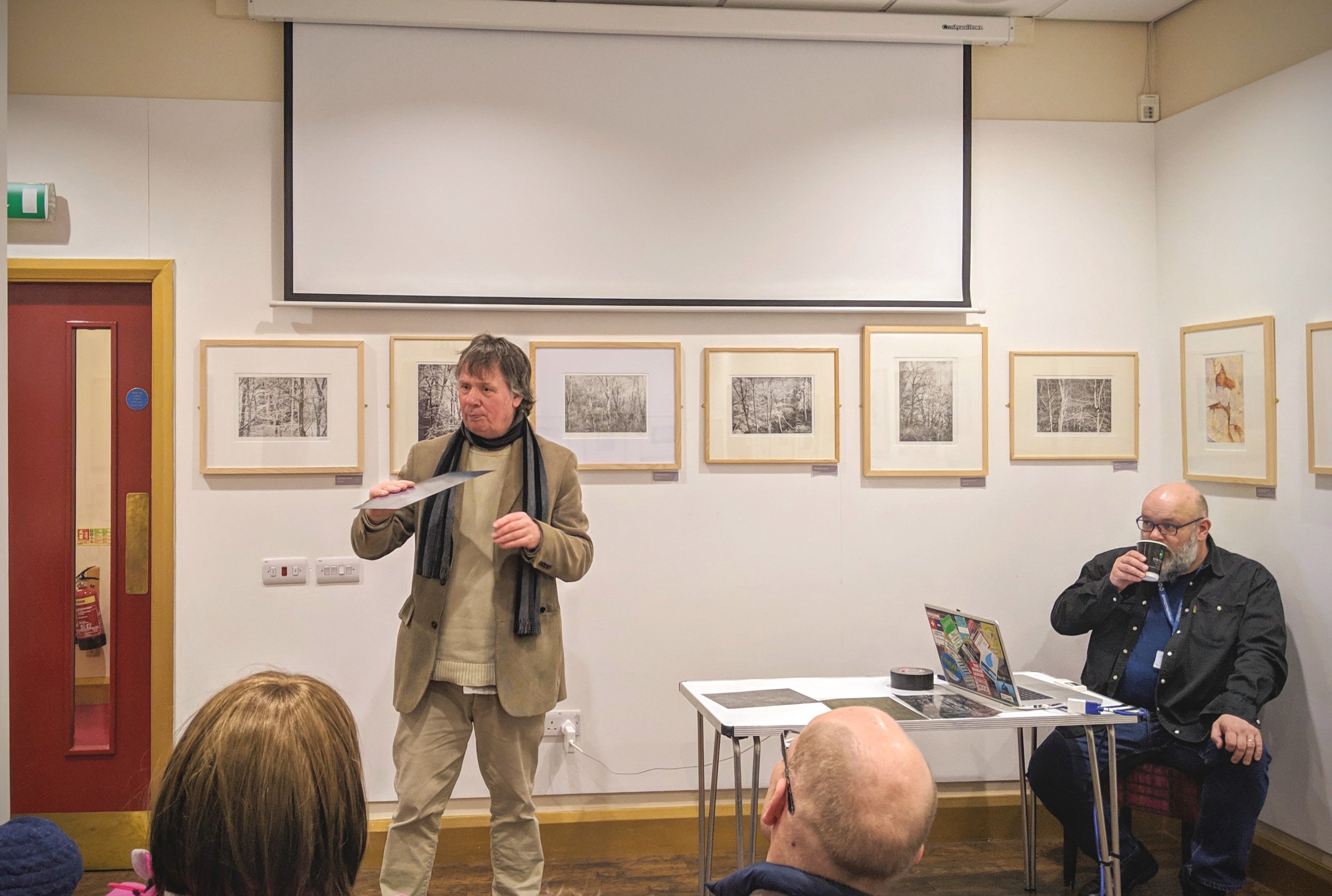 He explained that until recently, he had been wary of using photography as he felt this was almost like cheating. When he started using a digital SLR camera he discovered that the learning process was more complicated than he had anticipated; the main difficulty being obtaining a perfect tonal range which would be compatible with his printmaking processes. After a fair amount of "learning by mistakes" he has found that photography and image processing (layering in Photoshop) is now influencing his painting which has become "more abstract, in a round about way". He feels the main difference between most photographers and painters is that photographers feel they need to know what the end result will be at the time they press the shutter - i.e. classic 'pre-visualisation' as advocated by Ansel Adams (Schaefer, 1992) and the f64 group (and most photographers since then). In his printmaking, especially with multiple layers of coloured inks, he seldom knows what it will look like when finished and part of the process of abstraction is that the image evolves layer by layer, as it is being made.
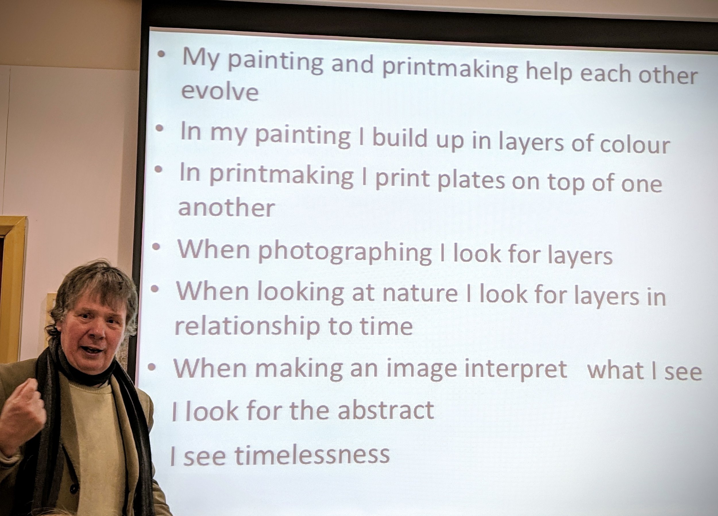 Expanding on this, he explained that in deciding what to photograph he looks for the the most obscure and abstract things he can find, often now looking in nature for visual representations of layers; one tree in front of others, shadows on rocks or sand, layers in dead wood or rock formations, layers in time. In interpreting what he can see, he is taking from nature then playing and abstracting from it. He described this process as "being like building with Lego - start with the finished object - take it apart then re-build it - it will look similar but not exactly the same".To my surprise, I found that I had more in common with his approach than I had expected. In discussion with the audience, he talked of shadows in art as having ambiguity, transience - similar to the feelings I have been trying to capture in my photographs of shadows. I had not previously grasped the significance of layers but in many of my images, that could be what gives them the impression of texture. I felt comfortable with his explanations of abstraction, a concept I have had difficulty fully understanding previously. He is clearly happy now using a hybrid of digital photography and traditional printing, feeding contemporary technology into long established analogue processes. He is going to be in Greece for the next couple of months but has offered to let some of us visit his studio to share his technical knowledge. Having never seen photo-etching in practice or intaglio prints being made, I still have some difficulty in understanding exactly how it works and this is now on my list to do over the summer. I am sure that the learning curve for developing his printmaking skills was much steeper and longer than it took him to get what he needed from digital photography but I am still interested in printing digital negatives on acetate for use with historical U-V light based photographic processes and his advice on file preparation and printing technique could be invaluable.His final comment on his acceptance of photography as a tool for image making was to concede that "the mobile phone has become the sketch-book of the 21st century".The images used to illustrate this post were captured on my mobile phone camera.Schaefer JP (1999) 'Visualisation: The Art of Seeing a Photograph' In: Ansel Adams Guide - Basic Techniques of Photography Book (1); Revised edition, Boston-New York-London, Little, Brown and Company, pp 131-134.

Colour in the landscape
The recent darkroom experiments with colour photograms have unexpectedly raised my level of awareness of colour when I am out walking with my camera. One of the drawbacks of digital imaging technology is the tendency to produce images with luridly over-saturated colours, either through over-enthusiastic processing by the users or their over-reliance on the software algorithms built in to modern cameras and mobile phones. The prevalence of this particularly in social media platforms has resulted in an expectation that landscapes will be vividly coloured, almost like a re-setting of the expected norm. We all however perceive colours differently and inconsistently - "in visual perception a colour is almost never seen as it really is - as it physically is" - and - "it is necessary to recognise that colour deceives continually", (Albers 1963).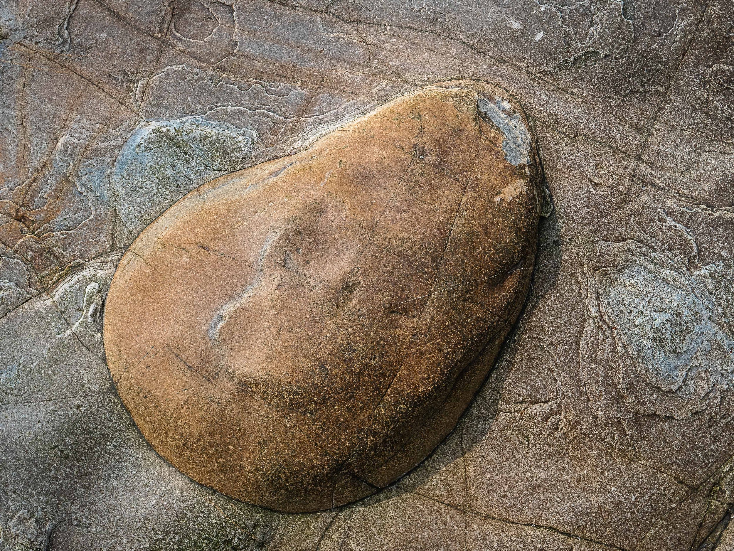 The rock formations photographed for this article are near the Western end of Porth Ceiriad on the Lleyn Peninsula. The colours in life are subtle and muted and I have 'enhanced' them to a point where they are no longer true representations of what I saw but the photographs are now a better representation of their perceived effect when I was there. I doubt if I would previously have treated them in this way but the result feels acceptable, perhaps because the interaction of the almost complementary orange browns and bluish greys remains harmonious. Nobody unless they were there at that time could know the difference but have I sacrificed photographic integrity for a more pleasing aesthetic effect?Albers J (1963). 'Interaction of Color'. New Haven, Yale University Press. p1 (My edition of this is the Fiftieth Anniversary (4th) Edition of the paperback version, still in print and published in 2013).

Elucidation or obfuscation: a reflection on academic writing styles.
The ability to adopt an 'academic' style of writing is a recognised requirement for any degree level research report and students soon discover that a good thesaurus is an invaluable tool for finding novel words, with which they can present their thoughts concisely but also precisely. Academic literature could be considered as one of the last remaining bastions protecting our languages from the phenomenon of 'dumbing down'. If a single specific word could replace a phrase or most of a sentence then it seems logical to utilise it. The problem with using relatively obscure terminology is that many people will never have encountered these words and find it necessary to refer to a dictionary to comprehend them. Their resulting perception of an author who uses technical or grandiose language, could generate a sense of frustration sufficient to discourage the reader from continuing any further, which would become counter-productive. The importance of using appropriate language was considered in our tutorial on auto-ethnographic research on 30th November. In writing for other people, if the aim is to explain a complex concept in comprehensive detail, while avoiding unnecessary verbosity, this requirement for clarity but also brevity is potentially contradictory. Slight miscalculation of the perceived intellectual capacity of the intended audience may create a risk that the excessive use of what to some becomes incomprehensible jargon, will to them equate with elitism, designed to preclude their participation. In others, the contrary perception of apparently being talked down to, may generate an equally negative effect. My ambiguous personal views in this respect, derive from my experience as a clinician, guiding patients through complex medical dilemmas, where effective communication was essential. I discovered that it was important to vary the level at which the discussion was pitched to where the individual patient was comfortable but in general, the more complex the issues, the greater the need for less obscure language.While this should not be a dilemma in an academic setting, one consequence of my past experiences is a (possibly irrational) sense of trying to appear to be intellectually ostentatious resulting in a strong desire to avoid this. Resolution of this will entail finding a balance between my compulsive tendency to oversimplification in the form of over-elaborate description and my need to get back into the habit of using appropriately formal academic terminology. Fortunately, I feel that I am developing a better sense of realising this degree of equipoise in the visual language of my photography, hence the featured image chosen as the header for this post.

Don McCullin at Tate Britain
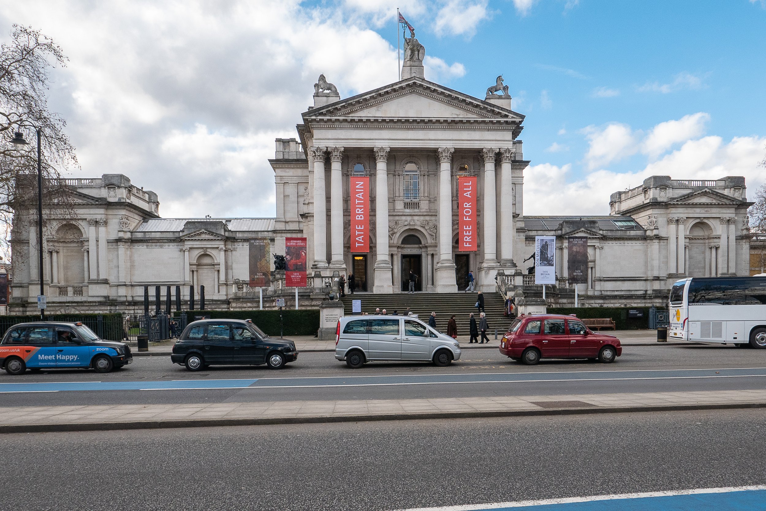 The other 'blockbuster' exhibition of photography currently showing in London, is a very substantial retrospective at Tate Britain of the work of Don McCullin, the first photographer to have been given this accolade. Built in 1892 (as the National Gallery of British Art), in contrast to the brutalist concrete of the South Bank, this is a more refined traditional Victorian art gallery with a classical portico entrance and a central dome. The layout of the exhibition also followed relatively traditional lines; exhibition quality monochrome silver gelatin prints (all printed by McCullin in his own darkroom), window mounted in plain black frames, evenly spaced as single images or in small groups and centered at eye level around the walls of eight substantial rooms. The photographs were presented in roughly chronological order, grouped geographically starting with his earliest images of gang members in east London in the late 1950's and moving on to images of conflict zones and famines in Berlin, Cyprus, the Middle East, Vietnam and Cambodia, Sudan, Biafra as well as those showing the effects of de-industrialisation, social deprivation, poverty and homelessness in London and Northern England. The captions were mostly simple place names but two or three images in each room had more detailed explanations, describing McCullin's own insights about the situations he found himself in.I already knew his work well from several of his books and having written an essay about his photography in Year 1 of the FdA course. There were no particular surprises on offer but the volume, range and power of the photographs was as impressive as anticipated, to the point of becoming almost overwhelming. These subject matter of these images is dark, moving, poignant, even shocking but the manifest empathy of the photographer for the individuals affected, the victims of these tragedies and his desire to ensure that their stories are told, totally dispels any notion of sensationalisation or exploitation. This impression is confirmed by Colin Jacobsen in his article about the exhibition in the British Journal of Photography, who also quotes Harold Evans, McCullin's former editor at The Sunday Times "He cared about the victims, the collateral damage" and "He couldn't express it in words, but he expressed it in his photography".Although the gallery was busy, the experience of being able to examine close up, the quality in the detail of these prints, from negatives exposed in often unimaginably challenging circumstances, made the journey worthwhile. This was particularly true of a group of his later photographs presented in the final room of the exhibition, some landscape images made near his home on the Somerset Levels.
 I have a second hand copy from America of his book 'Open Skies' published in 1989, which includes these photographs and have previously felt that they were so dark that they had been over-printed, blocking up the details in the shadow areas. Having now seen these photographs 'in the flesh', the detail in the shadows has been retained, the quality is superb and I can appreciate that the problem in the book is down to the reproduction of the images, emphasising the value in being able to get to see the original prints. In his introduction to the book, John Fowles speculates that the darkness of these images is a reflection of McCullin's 'state of mind' following his years of covering human tragedies all around the world, along with the tragedies of his own personal life.Thirty years further down the line and now aged 83, McCullin commented on this in a recent television documentary for BBC Four, confirming that as he has got older, he feels the need to make his prints darker, yet his mood now seems lighter and what was most apparent was his humility and that he still cares passionately about people, regardless of their background but especially the less fortunate among us.https://www.tate.org.uk/what's-on/tate-britain/exhibition/don-mccullinJacobsen, C., "Endframe, Don McCullin': British Journal of Photography, Issue 7882, p 98, April 2019.McCullin, D., 'Open Skies': Harmony Books, New York, 1989. (Originally published in Great Britain by Jonathon Cope).https://www.bbc.co.uk/iplayer/episode/m0002dv0/don-mccullin-looking-for-england, Accessed on 10/4/2019

'Obsolete and Discontinued'
'Every time I find a paper or film I like, they discontinue it' Paul StrandThe photographer and printer Mike Crawford (no relation) was given more than twenty boxes of out of date photographic paper by one of his clients who was clearing the darkroom of his uncle who had died several years earlier. The papers were between 20 and 40 years old and initial testing showed that while several of the boxes were unusable, with careful processing using modified development techniques some were capable of producing an image, albeit with some fogging or discolouration of the paper base. There was so much material that he decided to offer some of it to several colleagues around the country who were still practicing darkroom workers. The response was positive and having subsequently been contacted by several other interested photographers he initiated a collaborative project to produce a book of diverse images, the only criterion in common for selection being that they had been created with one of these papers. The end result is 'Obsolete and Discontinued' published by Brovira Press in 2018 and containing more than eighty plates, contributed by sixty individual darkroom workers from around the world. The selection consists of a wide range of abstract and figurative images using various historical and contemporary darkroom techniques including 'straight' lens based silver gelatin prints, lith prints, photograms, chemigrams, lumen prints, mordencage (emulsion lifts) and images made with pinhole cameras or from wet plate collodion and paper negatives. In spite of the diversity of the authors, subject matter and techniques, by concentrating on the materials used the final selection has produced a surprisingly cohesive feel to this set of highly original images, demonstrating the enthusiasm of the contributors for working with the richness of the quality obtainable from these aged papers.One of the contributors has commented that, 'when you work in the darkroom, you feel you are working with science and with nature; I feel a greater sense of ownership when I work with analogue processes' (Norris 2018), a feeling which I believe most of us who have experienced this environment would share. Although the colour papers and chemistry I have been using for my most recent work are not (as yet) obsolete, in my initial experiments in making monochrome photograms I used out of date silver gelatin papers, passed on to me by a colleague who had dismantled his darkroom, having converted to a digital workflow. I can closely relate to the aesthetic gratification derived from working with analogue materials but while the reasons for this are difficult to determine, the diversity and quality of the images this book are testament to my belief that this amounts to much more than simple nostalgia.While the published photobook was reproduced digitally (to a very high standard), the original prints were used in a touring exhibition, shown in Barcelona and Cologne in 2016 and London in 2018.Strand, Paul: as quoted in preface to 'Obsolete and Discontinued', Ed. Crawford, M., Brovira Press, London 2018.Norris, Yaz: collaborator's quote in 'Obsolete and Discontinued', Ed. Crawford, M., Brovira Press, London, p13-14, 2018.See also www.obsolete-discontinued.com

Progress with colour photograms
Having achieved at least a degree of control over colour filtration settings I have started to explore the potential of the process for making photograms in colour. To reproduce textural details in the images, the materials used need to be at least semi-transparent and the designs in waste plastic and glass food and drink containers from my recycle bin are looking like promising subjects. This has evolved from some earlier monochrome work and I have also photographed the textures in other more dense packaging using digital cameras. As a further strand of the exploration of this issue I have also started photographing rubbish and household goods washed up on beaches or illegally disposed in the countryside, problems which particularly affect coastal, island and rural communities, where access to recycling facilities is relatively limited.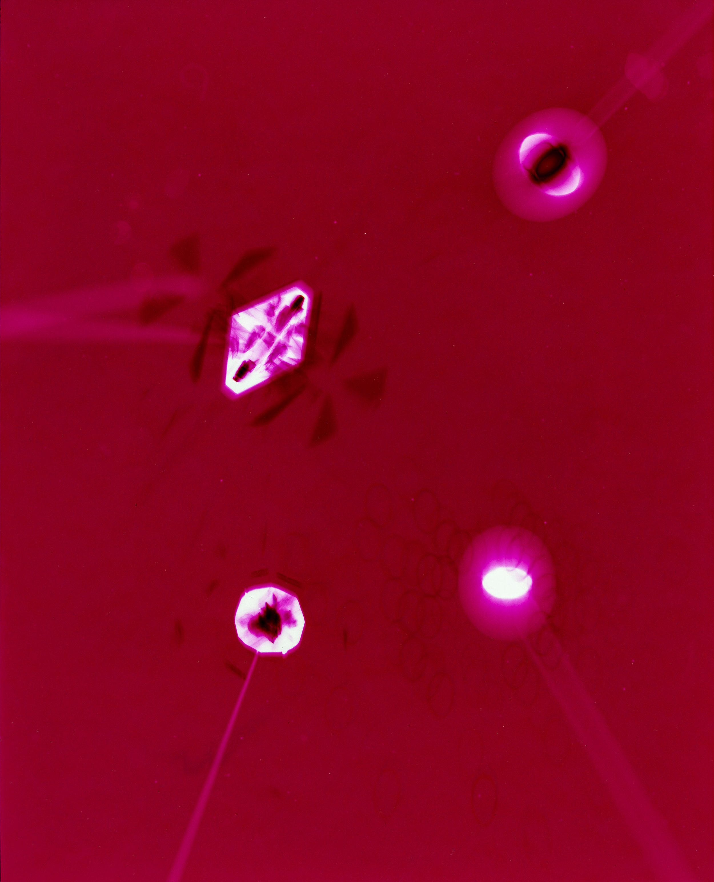 In these images, I have also tried to consider the design elements manufacturers incorporate to improve the effectiveness of the protection the packaging provides as well as making them more aesthetically attractive to potential customers. Although the images have been scanned for inclusion in this post, the original images were all produced using RA4 chemistry with colour photographic papers, sometimes using multiple exposures . The colours in some have been produced entirely by manipulation of the enlarger filters as in the image above but in others, the inherent colour of the materials has also been utilised - the image below was made using a turquoise blue container lid (the process resulting the in reverse complementary colour in the image)
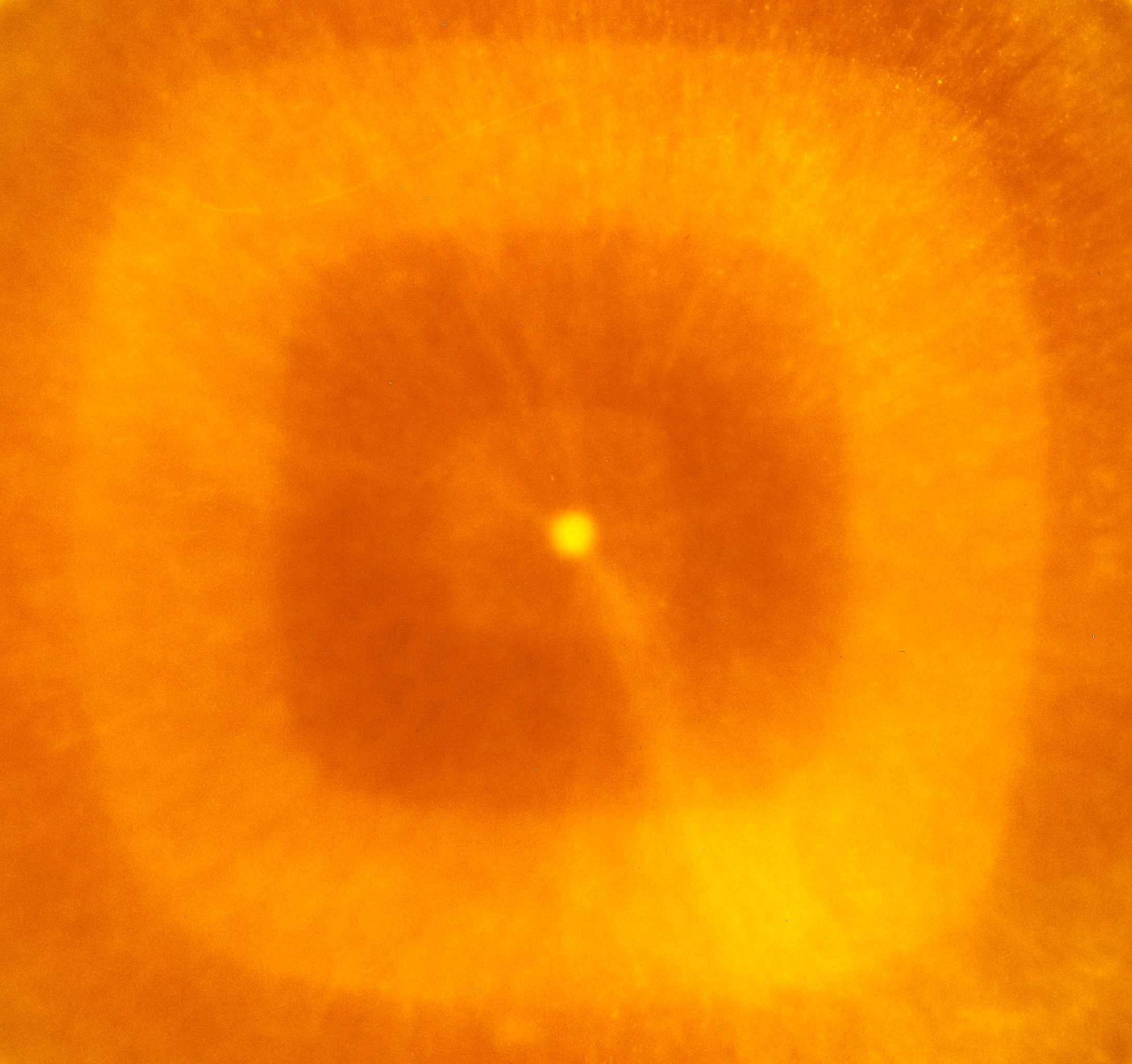 The analogue process used to produce the images could also be considered as a form of 'recycled' technology. Although still in use, the range of colour papers and chemistry is now very limited and most of those available are packaged in quantities for commercial automated machine processors rather than small scale or home use. The range and depth of colour which can be obtained is very encouraging - further experimentation is called for.