Two of the most influential texts on colour theory were written in the 1960's by two men with similar backgrounds but very different approaches to the subject. Both by that stage had recently retired from distinguished teaching careers to concentrate on being working artists, Johannes Itten (1888-1967) having been Director of the Museum of Arts and Crafts in Zurich and Josef Albers (1888 -1976), Chair of The Department of Design at the Yale University School of Art in Connecticut. Both men had strong connections with the Bauhaus School in Weimar Germany. Itten developed and ran the Preliminary Course which was compulsory for all first year students from its inception in 1919 until he fell out with Walter Gropius in 1923 and moved to Berlin to start his own school of design. He moved briefly to the Netherlands in 1938 before returning home to Switzerland later that year (Art Directory Gmbh, 2019). Having enrolled initially in 1920 Albers was the first Bauhaus student to join the teaching faculty as a Master in the glassmaking studio, at the time the school moved to Dessau in 1925. When the National Socialists came to power in Germany in 1933 and the Bauhaus finally closed, he and his wife were invited to establish the inaugural visual arts course at the Black Mountain College in North Carolina (albersfoundation.org, 2019). 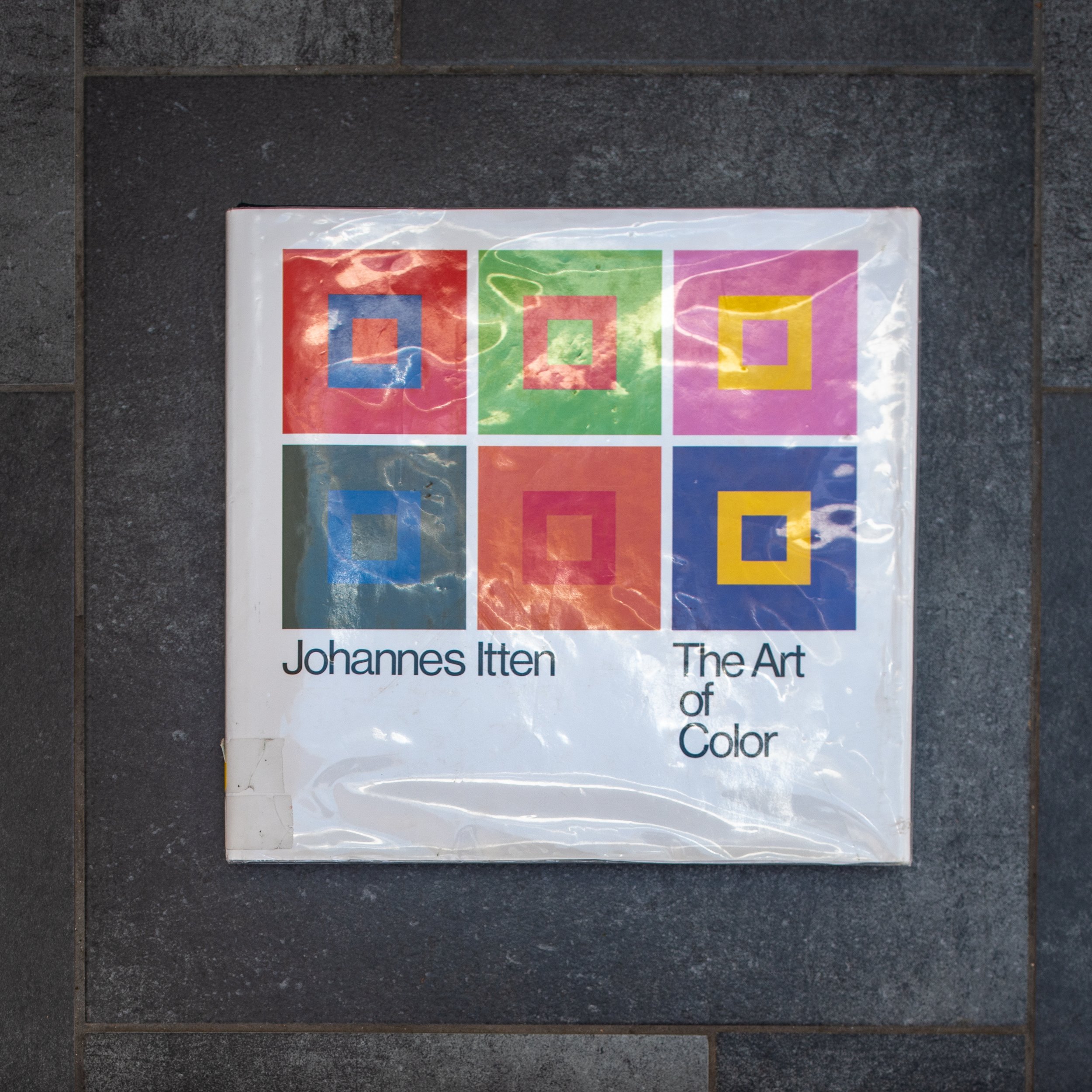 On first impression Art of Color : The subjective experience and objective rationale of color by Johannes Itten has the look and feel of a beautifully illustrated traditional large format textbook. The early chapters explain colour physics, with brief descriptions of the colour spectrum, the light forming wavelengths of electromagnetic radiation which are focused via the optical mechanism of the eye (cornea and lens) to be captured by the photosensitive cells in the retina (the sensor), then transmitted to the optical cortex of the brain to be perceived as a continually refreshed image. Subsequent chapters move on from these objective principles to his own theories (expanding on earlier work by Adolf Holzel with whom he had trained in Stuttgart), which explore how our subjective perception can be influenced by emotional and symbolic factors in combination with the visual interactions of complementary and contrasting colours (bauhaus100.com, 2019). "Color perception is the psycho-physiological reality as distinguished from the physio-chemical reality of color" (Itten, 1963). His explanations of the significance of these phenomena are illustrated by reference to a series of paintings ranging chronologically from eighth century religious paintings, through the work of the European old masters, to the abstract modern art of Klee (a fellow Master in the Bauhaus teaching faculty), Mondrian and Picasso. The book is worth reading for these comprehensive insightful explanations alone.The approach taken by Albers in the more modest looking Interaction of Color is that of a practical course manual for students in a colour theory classroom, presented as a series of exercises using swatches of coloured papers, designed to demonstrate rather than simply describe how interacting colours are perceived. The illustrations linked to each chapter are presented separately from the exercises, the aim being that students should first try to reproduce them for themselves, presumably as a more effective way of learning. Many of the exercises recreate apparent optical illusions (colour deceptions) but in doing so, provide rational explanations for complex phenomena and like Itten, demonstrating that "in visual perception there is a discrepancy between physical fact and psychic effect" (Albers, 1963). His demonstrations of the use of the effect of colour intensity (brightness) to show how an identical swatch of colour is perceived differently depending on the background it is placed against (page 8) and the phenomenon of the after image (page 22) are simple but remarkably effective.
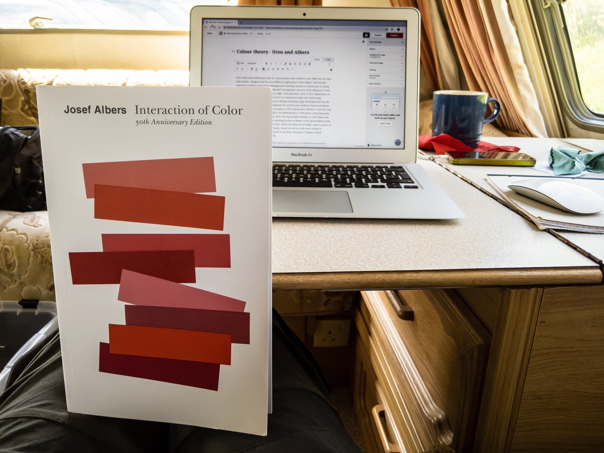 I am working my way through both of these books at present and am only just beginning to get to get to grips with the subject. The featured image below is my digital photograph of a step in a bathroom ceiling which is painted entirely white.
 The colours have been produced through manipulation of the RAW file in Adobe Photoshop Lightroom, simply by accentuating (albeit grossly) the existing colour casts in the image. The sunlit area is warm in tone, producing the primary colour yellow when enhanced, while the tone of the area in shadow is cool forming the complementary blue when accentuated. These casts are barely perceptible in the original photograph and not normally 'seen' by the naked eye as, knowing that the paint is white, our brain 'corrects' this for us. Photographers working in colour, in trying to obtain colours which are true to life, usually correct these casts when they become apparent. This experiment for me suggests that in reality the colours are already there, which would mean that in striving to obtain tones which will be perceived as 'true', we may in fact be perpetrating a deception. Albers J (1963). 'Interaction of Color'. New Haven, Yale University Press. (My edition of this is the Fiftieth Anniversary (4th) Edition of the paperback version, still in print and published in 2013)albersfoundation.org (2019). Josef and Anni Albers biographies. Online, Accessed 27 April, 2019 at: www.albersfoundation.org/artists/biographies/Art Directory Gmbh (2019). Johannes Itten Biography. Online, Accessed 2 May, 2019 at: www.johannes-itten.combauhaus100.com (2019) Johannes Itten. Online, Accessed 2 May 2019 at: https://www.bauhaus100.com/the-bauhaus/people/masters-and-teachers/johannes-itten/Itten J (1973) 'Art of Color : The subjective experience and objective rationale of color'. New York, John Wiley and Sons Inc. (first published in Germany in 1961 by Otto Maier Verlag)